Welcome
Written for v6.0

|

|

|

|
Welcome to LittlevGL Embedded GUI Library

LittlevGL is a free and open-source graphics library providing everything you need to create embedded GUI with easy-to-use graphical elements, beautiful visual effects and low memory footprint.
Key features
- Powerful building blocks buttons, charts, lists, sliders, images etc
- Advanced graphics with animations, anti-aliasing, opacity, smooth scrolling
- Various input devices touch pad, mouse, keyboard, encoder etc
- Multi language support with UTF-8 encoding
- Fully customizable graphical elements
- Hardware independent to use with any microcontroller or display
- Scalable to operate with little memory (80 kB Flash, 10 kB RAM)
- OS, External memory and GPU supported but not required
- Single frame buffer operation even with advanced graphical effects
- Written in C for maximal compatibility (C++ compatible)
- Simulator to start embedded GUI design on PC without embedded hardware
- Tutorials, examples, themes for rapid GUI design
- Documentation online and offline
- Free and open-source under MIT licence
Requirements
- 16, 32 or 64 bit microcontroller or processor
- 16 MHz clock speed
- 8 kB RAM for static data and >2 KB RAM for dynamic data (graphical objects)
- 64 kB program memory (flash)
- Optionally ~1/10 screen sized memory for internal buffering (at 240 × 320, 16 bit colors it means 15 kB)
- C99 or newer compiler
The LittlevGL is designed to be highly portable and to not use any external resources:
- No external RAM required (but supported)
- No float numbers are used
- No GPU needed (but supported)
- Only a single frame buffer is required located in:
- Internal RAM or
- External RAM or
- External display controller's memory
If you would like to reduce the required hardware resources you can:
- Disable the unused object types to save RAM and ROM
- Change the size of the graphical buffer to save RAM (see later)
- Use more simple styles to reduce the rendering time
Get started
Written for v6.0
Readings
- lvgl on GihHub
- example projects
- porting example C files
Live demo
See look and feel
Micropython
play with it in micropython
PC simualtor
You can try out the LittlevGL using only your PC without any development boards. Write a code, run it on the PC and see the result on the monitor. It is cross-platform: Windows, Linux and OSX are supported.
The written code is portable, you can simply copy it when using an embedded hardware.
The simulator is also very useful to report bugs because it means common platform for every user. So it's a good idea the reproduce a bug in simualtor and use the code snippen in the Forum.
Select an IDE
The simulator is ported to valrious IDEs. Choose your favourite IDE, read its README on GitHub, download the project, and load it to the IDE.
| Eclipse | CodeBlocks | Visual Studio | PlatformIO | Qt Creator |
|---|---|---|---|---|
 |
 |
 |
 |
 |
| Cross-platform with SDL |
Native Windows | Cross-platform with SDL |
Cross-platform with SDL |
Cross-platform with SDL |
In followings the set-up guide of Eclipse CDT is described in more details.
Set-up Eclipse CDT
Install Eclipse CDT
Eclipse CDT is C/C++ IDE. You can use other IDEs as well but in this tutorial the configuration for Eclipse CDT is shown.
Eclipse is a Java based software therefore be sure Java Runtime Environment is installed on your system.
On Debian-based distros (e.g. Ubuntu): sudo apt-get install default-jre
You can download Eclipse's CDT from: https://eclipse.org/cdt/. Start the installer and choose Eclipse CDT from the list.
Install SDL 2
The PC simulator uses the SDL 2 cross platform library to simulate a TFT display and a touch pad.
On Linux you can easily install SDL2 using a terminal:
- Find the current version of SDL2:
apt-cache search libsdl2 (e.g. libsdl2-2.0-0) - Install SDL2:
sudo apt-get install libsdl2-2.0-0(replace with the found version) - Install SDL2 development package:
sudo apt-get install libsdl2-dev - If build essentials are not installed yet:
sudo apt-get install build-essential
If you are using Windows firstly you need to install MinGW (64 bit version). After it do the following steps to add SDL2:
- Download the development libraries of SDL.
Go to https://www.libsdl.org/download-2.0.php and download Development Libraries: SDL2-devel-2.0.5-mingw.tar.gz - Uncompress the file and go to _x86_64-w64-mingw32_ directory (for 64 bit MinGW) or to i686-w64-mingw32 (for 32 bit MinGW)
- Copy _...mingw32/include/SDL2 folder to _C:/MinGW/.../x86_64-w64-mingw32/include_
- Copy _...mingw32/lib/ content to _C:/MinGW/.../x86_64-w64-mingw32/lib_
- Copy _...mingw32/bin/SDL2.dll to _{eclipse_worksapce}/pc_simulator/Debug/_. Do it later when Eclipse is installed.
Note: If you will use Microsoft Visual Studio instead of Eclipse then you don't have to install MinGW.
On OSX you can easily install SDL2 with brew: brew install sdl2
If something is not working I suggest this tutorial to get started with SDL.
Pre-configured project
A pre-configured graphics library project (based on the latest release) is always available. You can find it on GitHub or on the Download page. (The project is configured for Eclipse CDT.)
Add the pre-configured project to Eclipse CDT
Run Eclipse CDT. It will show a dialogue about the workspace path. Before accepting it check that path and copy (and unzip) the downloaded pre-configured project there. Now you can accept the workspace path. Of course you can modify this path but in that case copy the project to that location.
Close the start up window and go to File->Import and choose General->Existing project into Workspace. Browse the root directory of the project and click Finish
On Windows you have to do two additional things:
- Copy the SDL2.dll into the project's Debug folder
- Righ click on the project -> Project properties -> C/C++ Build -> Settings -> Libraries -> Add ... and add mingw32 above SDLmain and SDL. (The order is important: mingw32, SDLmain, SDL)
Compile and Run
Now you are ready to run the Littlev Graphics Library on your PC. Click on the Hammer Icon on the top menu bar to Build the project. If you have done everything right you will not get any errors. Note that on some systems additional steps might be required to "see" SDL 2 from Eclipse but in most of cases the configurtions in the downloaded project is enough.
After a success build click on the Play button on the top menu bar to run the project. Now a window should appear in the middle of your screen.
Now everything is ready to use the Littlev Graphics Library in the practice or begin the development on your PC.
Porting
Written for v6.0
System architecture
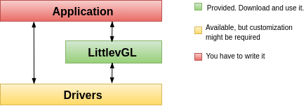
Application Your application which creates the GUI and handles the specific tasks.
LittlevGL The graphics library itself. Your application can communicate with the library to create a GUI. It contains a HAL (Hardware Abstraction Layer) interface to register your display and input device drivers.
Driver Besides your specific drivers, it contains functions to drive your display, optionally to a GPU and to read the touchpad or buttons.
There are two typical hardware set-ups depending on the MCU has an LCD/TFT driver periphery or not. In both cases, a frame buffer will be required to store the current image of the screen.
MCU with TFT/LCD driver If your MCU has a TFT/LCD driver periphery then you can connect a display directly via RGB interface. In this case, the frame buffer can be in the internal RAM (if the MCU has enough RAM) or in the external RAM (if the MCU has a memory interface).
External display controller If the MCU doesn't have TFT/LCD driver interface then an external display controller (E.g. SSD1963, SSD1306, ILI9341) has to be used. In this case, the MCU can communicate with the display controller via Parallel port, SPI or sometimes I2C. The frame buffer is usually located in the display controller which saves a lot of RAM for the MCU.
Set-up a project
Get the library
The Littlev Graphics Library is available on GitHub: https://github.com/littlevgl/lvgl. You can clone or download the latest version of the library from here or you can use the Download page as well.
The graphics library is the lvgl directory which should be copied into your project.
Config file
There is a configuration header file for LittlevGL called lv_conf.h. It sets the library's basic behavior, disable unused modules and features, adjust the size of memory buffers in compile time.
Copy lvgl/lv_conf_template.h next to the lvgl directory and rename it to lv_conf.h. Open the file and change the #if 0 at the beginning to #if 1 to enable its content.
In the config file comments explain the meaning of the options. Check at least these three config options and modify them according to your hardware:
- LV_HOR_RES_MAX Your display's horizontal resolution
- LV_VER_RES_MAX Your display's vertical resolution
- LV_COLOR_DEPTH 8 for (RG332), 16 for (RGB565) or 32 for (RGB888 and ARGB8888).
Initialization
In order to use the graphics library you have to initialize it and the other components too. To order of the initialization is:
- Call lv_init()
- Initialize your drivers
- Register the display and input devices drivers in LittlevGL. (see below)
- Call
lv_tick_inc(x)in everyxmilliseconds in an interrupt to tell the elapsed time. (see below) - Call
lv_task_handler()periodically in every few milliseconds to handle LittlevGL realted tasks. (see below)
Display interface
To set up a display an lv_disp_buf_t and an lv_disp_drv_t variable has to be initialized.
- lv_disp_buf_t contains internal graphics buffer(s).
- lv_disp_drv_t contains callback functions to iteract with your display and manipulate drawing related things.
Display buffer
lv_disp_buf_t can bin initalized like this:
    /*A static or global variable to store the buffers*/
    static lv_disp_buf_t disp_buf;

    /*Static or global buffer(s). The second buffer is optional*/
    static lv_color_t buf_1[MY_DISP_HOR_RES * 10];
    static lv_color_t buf_2[MY_DISP_HOR_RES * 10];

    /*Initalize `disp_buf` with the buffer(s) */
    lv_disp_buf_init(&disp_buf, buf_1, buf_2, MY_DISP_HOR_RES*10);
There are there possible configurations regarding to the buffer size:
- Only one buffer this buffer will be used the render the conent of the display. Should enough to hold at least 10 lines. LittlevGL will redraw the screen in chucks whcih fit into the buffer. However if only a smaller area is needs to be redrawn (like buttn when pressed) only the that small area will be redrawn. It can be screen-sized as well.
- Two non screen-sized buffers having two buffer LittlevGL can draw into one buffer while the content of the other buffer is sent to display in the background. DMA or other hardware should be used to transfer the data to the display to let the CPU draw meanwhile. This way the rendering and refreshing of the display become parallel. Similarly to the Only one buffer LittelvGL will drawn the display's content in chunks which size is at most the size of the buffer.
- Two screen-sized buffers In contast to Two non screen-sized buffers LittelvGL will always provide the whole screen's content not only chunks. This way the driver can simply change the address of the frame buffer to the buffer received from LittlevGL. Therefore this method works the best when the MCU has an LCD/TFT inteface and the frambuffer is just a loaction in the RAM.
Display driver
Once the buffer iitialization is ready the display drivers needs to initalized. In the most simple case only the following two fields of lv_disp_drv_t needs to be set:
- buffer pointer to an initialized
lv_disp_buf_tvariable. - flush_cb a callback function to copy a buffer's content to a specific area of the display.
And there are some optinal data fields:
- hor_res horizontal resolution of teh display. (LV_HOR_RES_MAX by default)
- ver_res vertical resolution of teh display. (LV_VER_RES_MAX by default)
- color_chroma_key a color which will be drawn as transparent on CHhrome keyed images. LV_COLOR_TRANSP by deafult (lv_conf.h)
- user_data custom user data for the driver. Its type acn be modified in lv_conf.h. (Optional)
- antialiasing use anti-aliasing (edge smoothing). LV_ANTIALIAS by deafult (lv_conf.h)
- rotated if
1swap hor_res and ver_res. LittelvGL draws in tha same direction in both case (in lines from top to buttom) so the driver also need to be reconfigured to change the display's fill direction.
To use a GPU the following callbacks can be used:
- mem_fill_cb fill an area with a colors.
- mem_blend_cb blend two buffers using opacity.
Some other optional callbacks to make easier and more optimal to work with monochrome, grayscale or other less standard dislays:
- rounder_cb round the coordinates of areas to redraw. E.g. a 2x2 px can be converted to 2x8. It can be used if the display controller can refresh only areas with specific height or width (usually 8 px height with monochrome displays).
- set_px_cb a custom function to write the buffer.
It can be used to store the pixels in more compact way if the display has a special color format. (e.g. 1 bit monochrome, 2 bit grayscale etc.)
The buffers used in
lv_disp_buf_tcan be smaller to hold only the required number of bits for the given area size. - monitor_cb a callback function tell how many pixels were refreshed in how much time.
To set the fields of lv_disp_drv_t variable it needs to be intialized with lv_disp_drv_init(&disp_drv).
And finally to register a display for LittlevGL the lv_disp_drv_register(&disp_drv) needs to be used.
All togother it looks like this:
    lv_disp_drv_t disp_drv;                 /*A variable to hold the drivers. Can be local varaible*/
    lv_disp_drv_init(&disp_drv);            /*Basic initialization*/
    disp_drv.buffer = &disp_buf;            /*Set an initialized buffer*/
    disp_drv.flush_cb = my_flush_cb;        /*Set a flush callback to draw to the display*/
    lv_disp_t * disp;
    disp = lv_disp_drv_register(&disp_drv); /*Register the direver and save the created display objects*/
Here some simple examples of the callbacks:
void my_flush_cb(lv_disp_drv_t * disp_drv, const lv_area_t * area, lv_color_t * color_p)
{
    /*The most simple case (but also the slowest) to put all pixels to the screen one-by-one*/
    int32_t x, y;
    for(y = area->y1; y <= area->y2; y++) {
        for(x = area->x1; x <= area->x2; x++) {
            put_px(x, y, *color_p)
            color_p++;
        }
    }

    /* IMPORTANT!!!
     * Inform the graphics library that you are ready with the flushing*/
    lv_disp_flush_ready(disp);
}

void my_mem_fill_cb(lv_disp_drv_t * disp_drv, lv_color_t * dest_buf, const lv_area_t * dest_area, const lv_area_t * fill_area, lv_color_t color);
{
    /*It's an example code which should be done by your GPU*/
    uint32_t x,y;
    for(y = 0; i < length; i++) {
        dest[i] = color;
    }
}

void my_mem_blend_cb(lv_disp_drv_t * disp_drv, lv_color_t * dest, const lv_color_t * src, uint32_t length, lv_opa_t opa)
{
    /*It's an example code which should be done by your GPU*/
    uint32_t i;
    for(i = 0; i < length; i++) {
        dest[i] = lv_color_mix(dest[i], src[i], opa);
    }
}

void my_rounder_cb(lv_disp_drv_t * disp_drv, lv_area_t * area)
{
  /* Update the areas as needed. Can be only larger.
   * For example to always have lines 8 px hegiht:*/
   area->y1 = area->y1 & 0x07;
   area->y2 = (area->y2 & 0x07) + 8;
}

void my_set_px_cb(lv_disp_drv_t * disp_drv, uint8_t * buf, lv_coord_t buf_w, lv_coord_t x, lv_coord_t y, lv_color_t color, lv_opa_t opa)
{
    /* Write to the buffer as required for the display.
     * Write only 1 bit for monochrome displays mapped vertically:*/
      buf += buf_w * (y >> 3) + x;
      if(lv_color_brightness(color) > 128) (*buf) |= (1 << (y % 8));
      else (*buf) &= ~(1 << (y % 8));
}

void my_monitor_cb(lv_disp_drv_t * disp_drv, uint32_t time, uint32_t px)
{
  printf("%d px refreshed in %d ms\n", time, ms);
}
Multi-display support
In LittlevGL multiple displays can be used. Just initlaizes multiple drivers and buffer and register them. Each display have its own screens and objects on the screens.
To get curently active scrren of a dsplay use lv_disp_get_scr_act(disp) (where disp is the return value of lv_disp_drv_register). To set a new screen as active on a display use lv_disp_set_scr_act(screen1).
Or in a shorter form set a default display with lv_disp_set_default(disp) and get/set the active screen with lv_scr_act() and lv_scr_load().
Learn morea bout screens in the Objects section.
Input device interface
To set up an input device an lv_indev_drv_t variable has to be initialized:
lv_indev_drv_t indev_drv;lv_indev_drv_init(&indev_drv);  /*Basic initialization*/
indev_drv.type =.../*See below.*/
indev_drv.read =.../*See below.*/
lv_indev_drv_register(&indev_drv);  /*Register the driver in LittlevGL*/
type can be
- LV_INDEV_TYPE_POINTER: touchpad or mouse
- LV_INDEV_TYPE_KEYPAD: keyboard
- LV_INDEV_TYPE_ENCODER: left, right, push
- LV_INDEV_TYPE_BUTTON: external buttons pressing the screen
read is a function pointer which will be called periodically to report the current state of an input device. It can also buffer data and return false when no more data to be read or true when the buffer is not empty.
To learn more about input devices visit Input devices.
Touchpad, mouse or any pointer
indev_drv.type = LV_INDEV_TYPE_POINTER;
indev_drv.read = my_input_read;
The read function should look like this:
bool my_input_read(lv_indev_data_t*data)
{
    data->point.x = touchpad_x;
    data->point.y = touchpad_y;
    data->state = LV_INDEV_STATE_PR or LV_INDEV_STATE_REL;
    return false; /*No buffering so no more data read*/
}
IMPORTANT NOTE: Touchpad drivers must return the last X/Y coordinates even when the state is
LV_INDEV_STATE_REL.
Keypad or keyboard
indev_drv.type = LV_INDEV_TYPE_KEYPAD;
indev_drv.read = my_input_read;
The read function should look like this:
bool keyboard_read(lv_indev_data_t*data){
  data->key = last_key();            /*Set the last pressed or released key*/
  if(key_pressed()){
    data->state = LV_INDEV_STATE_PR;
  }
  else{
    data->state = LV_INDEV_STATE_REL;
  }
  return false; /*No buffering so no more data read*/
}
To use a keyboard:
- Register a read function (like above) with _LV_INDEV_TYPE_KEYPAD_ type.
- _USE_LV_GROUP_ has to be enabled in _lv_conf.h_
- An object group has to be created: _lv_group_create()_ and objects have to be added: _lv_group_add_obj()_
- The created group has to be assigned to an input device: _lv_indev_set_group(my_indev, group1);_
- Use _LV_GROUP_KEY_..._ to navigate among the objects in the group
Visit Touchpad-less navigation to learn more.
Encoder
With an encoder you can do 4 things:
- press its button
- long press its button
- turn left
- turn right
By turning the encoder you can focus on the next/previous object. When you press the encoder on a simple object (like a button), it will be clicked. If you press the encoder on a complex object (like a list, message box etc.) the object will go to edit mode where by turning the encoder you can navigate inside the object. To leave edit mode press long the button.
indev_drv.type = LV_INDEV_TYPE_ENCODER;
indev_drv.read = my_input_read;
The read function should look like this:
bool encoder_read(lv_indev_data_t*data){
  data->enc_diff = enc_get_new_moves();
  if(enc_pressed()){
    data->state = LV_INDEV_STATE_PR;
  }
  else{
    data->state = LV_INDEV_STATE_REL;
  }

  return false; /*No buffering so no more data read*/
}- To use an
ENCODER, similarly to theKEYPAD, the objects should be added to groups
Button
indev_drv.type = LV_INDEV_TYPE_BUTTON;
indev_drv.read = my_input_read;
The read function should look like this:
bool button_read(lv_indev_data_t*data){
    static uint32_t last_btn = 0;   /*Store the last pressed button*/
    int btn_pr = my_btn_read();     /*Get the ID (0,1,2...) of the pressed button*/
    if(btn_pr >= 0) {               /*Is there a button press?*/
       last_btn = btn_pr;           /*Save the ID of the pressed button*/
       data->state = LV_INDEV_STATE_PR;  /*Set the pressed state*/
    } else {
       data->state = LV_INDEV_STATE_REL; /*Set the released state*/
    }

    data->btn = last_btn;            /*Set the last button*/

    return false;                    /*No buffering so no more data read*/
}- The buttons need to be assigned to pixels on the screen using
lv_indev_set_button_points(indev, points_array). Where _points_array_ look likeconst lv_point_t points_array[] = { {12,30},{60,90}, ...}
Tick interface
The LittlevGL uses a system tick. Call the lv_tick_inc(tick_period) function periodically and tell the call period in milliseconds. For example if called in every milliseconds: lv_tick_inc(1).
It is required for LittlevGL to know the elapsed time. Therefore lv_tick_inc should be called in a higher priority then lv_task_handler(), for example in an interrupt.
Task handling
To handle the tasks of LittlevGL you need to call lv_task_handler() periodically in one of the followings:
- while(1) of main() function
- timer interrupt periodically (low priority then
lv_tick_inc()) - an OS task periodically
The timing is not critical but it should be about 5 milliseconds to keep the system responsive.
Example:
while(1) {
  lv_task_handler();
  my_delay_ms(5);
}
Handling sleep
The MCU can go to sleep when no user input happens. In this case the main while(1) should look like this:
while(1) {
  /*Normal operation in < 1 sec inactivity*/
  if(lv_disp_get_inactive_time(NULL) < 1000) {
      lv_task_handler();
  }
  /*Sleep after 1 sec inactivity*/
  else {
      timer_stop();   /*Stop the timer where lv_tick_inc() is called*/
      sleep();            /*Sleep the MCU*/
  }
  my_delay_ms(5);
}
You should also add these lines to your input device read function if a press happens:
lv_tick_inc(LV_REFR_PERIOD);  /*Force task execution on wake-up*/
timer_start();                /*Restart the timer where lv_tick_inc() is called*/
lv_task_handler();            /*Call `lv_task_handler()` manually to process the press event*/
In addition to lv_disp_get_inactive_time() you can check lv_anim_count_running() to see if every animations are finished.
Using with an operating system
LittlevGL is not thread-safe by deafult. Despite it, it's quite simple to use LittlevGL inside an operating system.
The simple scenario is to don't use the operating system's tasks but use lv_tasks. An lv_task is a function called periodically in lv_task_handler.
In the lv_task you can get the state of the sensors, buffers etc and call LittlevGL functions to refresh the GUI.
To create an lv_task use: lv_task_create(my_func, period_ms, LV_TASK_PRIO_LOWEST/LOW/MID/HIGH/HIGHEST, custom_ptr)
If you need to use other task or threads you need one mutex which should be taken before calling lv_task_handler and released after it.
In addition, you have to use to that mutex in other tasks and threads around every LittlevGL (lv_...) related code.
This way you can use LittlevGL in a real multitasking environment. Just use a mutex to avoid concurrent calling of LittlevGL functions.
Objects
Written for v5.1
In the Littlev Graphics Library the basic building blocks of a user interface are the objects. For example:
Click to check all the existing Object types
Object attributes
Basic attributes
The objects have basic attributes which are common independently from their type:
- Position
- Size
- Parent
- Drag enable
- Click enable etc.
You can set/get this attributes with lv_obj_set_... and lv_obj_get_... functions. For example:
/*Set basic object attributes*/
lv_obj_set_size(btn1, 100, 50);                        /*Button size*/
lv_obj_set_pos(btn1, 20,30);                        /*Button position*/
To see all the available functions visit the Base object's documentation.
Specific attributes
The object types have special attributes. For example a slider have:
- Min. max. values
- Current value
- Callback function for new value set
- Styles
For these attributes every object type have unique API functions. For example for a slider:
/*Set slider specific attributes*/
lv_slider_set_range(slider1, 0, 100);            /*Set min. and max. values*/
lv_slider_set_value(slider1, 40);            /*Set the current value (position)*/
lv_slider_set_action(slider1, my_action);        /*Set a callback function*/
Object's working mechanisms
Parent-child structure
A parent can be considered as the container of its children. Every object has exactly one parent object (except screens) but a parent can have unlimited number of children. There is no limitation for the type of the parent but there typically parent (e.g. button) and typical child (e.g. label) objects.
Screen – the most basic parent
The screen is a special object which has no parent object. Always there is an active screen. By default, the library creates and loads one. To get the currently active screen use the lv_scr_act() function.
A screen can be created with any object type, for example, a basic object or an image to make a wallpaper.
Moving together
If the position of the parent is changed the children will move with the parent. Therefore all positions are relative to the parent. So the (0;0) coordinates mean the objects will remain in the top left-hand corner of the parent independently from the position of the parent.

lv_obj_t * par = lv_obj_create(lv_scr_act(), NULL);     /*Create a parent object on the current screen*/
lv_obj_set_size(par, 100, 80);                        /*Set the size of the parent*/

lv_obj_t * obj1 = lv_obj_create(par, NULL);            /*Create an object on the previously created parent object*/
lv_obj_set_pos(obj1, 10, 10);                    /*Set the position of the new object*/
Modify the position of the parent:

lv_obj_set_pos(par, 50, 50); /*Move the parent. The child will move with it.*/Visibility only on parent
If a child partially or totally out of its parent then the parts outside will not be visible.

lv_obj_set_x(obj1, -30); /*Move the child a little bit of the parent*/Create - delete objects
In the graphics library objects can be created and deleted dynamically in run-time. It means only the currently created objects consume RAM. For example, if you need a chart you can create it only when it is required and delete after it is used.
Every objects type has its own create function with an unified prototype. It needs two parameters: a pointer the parent object and optionally a pointer to an other object with the same type. If the second parameter is not NULL then this objects will be copied to the new one. To create a screen give NULL as parent. The return value of the create function is a pointer to the created object. Independently from the object type a common variable type lv_obj_t is used. This pointer can be used later to set or get the attributes of the object. The create functions look like this:
lv_obj_t * lv_type_create(lv_obj_t * parent, lv_obj_t * copy);There is a common delete function for all object types. It deletes the object and all of its children.
void lv_obj_del(lv_obj_t * obj);You can delete only the children of an object but leave the object itself "alive":
void lv_obj_clean(lv_obj_t * obj);Layers
The earlier created object (and its children) will be drawn earlier (nearer to the background). In other words, the lastly created object will be on the top among its siblings. It is very important, the order is calculated among the objects on the same level ("siblings").
Layers can be added easily by creating 2 objects (which can be transparent) firstly 'A' and secondly 'B'. 'A' and every object on it will be in the background and can be covered by 'B' and its children.

/*Create a screen*/
lv_obj_t * scr = lv_obj_create(NULL, NULL);
lv_scr_load(scr);                                   /*Load the screen*/

/*Create 2 buttons*/
lv_obj_t * btn1 = lv_btn_create(scr, NULL);         /*Create a button on the screen*/
lv_btn_set_fit(btn1, true, true);                   /*Enable to automatically set the size according to the content*/
lv_obj_set_pos(btn1, 60, 40);                          /*Set the position of the button*/

lv_obj_t * btn2 = lv_btn_create(scr, btn1);         /*Copy the first button*/
lv_obj_set_pos(btn2, 180, 80);                         /*Set the position of the button*/

/*Add labels to the buttons*/
lv_obj_t * label1 = lv_label_create(btn1, NULL);    /*Create a label on the first button*/
lv_label_set_text(label1, "Button 1");              /*Set the text of the label*/

lv_obj_t * label2 = lv_label_create(btn2, NULL);      /*Create a label on the second button*/
lv_label_set_text(label2, "Button 2");                /*Set the text of the label*/

/*Delete the second label*/
lv_obj_del(label2);
Styles
Written for v5.1
To set the appearance of the objects styles can be used. A style is a structure variable with attributes like colors, paddings, visibility, and others. There is common style type: lv_style_t.
By setting the fields of an lv_style_t structure you can influence the appearance of the objects using that style.
The objects store only a pointer to a style so the style cannot be a local variable which is destroyed after the function exists. You should use static, global or dynamically allocated variables.
lv_style_t style_1;             /*OK! Global variables for styles are fine*/
static lv_style_t style_2;      /*OK! Static variables outside the functions are fine*/
void my_screen_create(void)
{
  static lv_style_t style_3;    /*OK! Static variables in the functions are fine*/
  lv_style_t style_1;           /*WRONG! Styles can't be local variables*/

  ...
}
Style properties
A style has 5 main parts: common, body, text, image and line. An object will use that fields which are relevant for it. For example, Lines don't care about the letter_space. To see which fields are used by an object type see their documentation.
The fields of a style structure are the followings:
- Common properties
- glass 1: Do not inherit this style (see below)
- Body style properties Used by the rectangle-like objects
- body.empty Do not fill the rectangle (just draw border and/or shadow)
- body.main_color Main color (top color)
- body.grad_color Gradient color (bottom color)
- body.radius Corner radius. (set to LV_RADIUS_CIRCLE to draw circle)
- body.opa Opacity (0..255 or LV_OPA_TRANSP, LV_OPA_10, LV_OPA_20 ... LV_OPA_COVER)
- body.border.color Border color
- body.border.width Border width
- body.border.part Border parts (LV_BORDER_LEFT/RIGHT/TOP/BOTTOM/FULL or 'OR'ed values)
- body.border.opa Border opacity
- body.shadow.color Shadow color
- body.shadow.width Shadow width
- body.shadow.type Shadow type (LV_SHADOW_BOTTOM or LV_SHADOW_FULL)
- body.padding.hor Horizontal padding
- body.padding.ver Vertical padding
- body.padding.inner Inner padding
- Text style properties Used by the objects which show texts
- text.color Text color
- text.font Pointer to a font
- text.opa Text opacity (0..255 or LV_OPA_TRANSP, LV_OPA_10, LV_OPA_20 ... LV_OPA_COVER)
- text.letter_space Letter space
- text.line_space Line space
- Image style properties Used by image-like objects or icons on objects
- image.color Color for image re-coloring based on the pixels brightness
- image.intense Re-color intensity (0..255 or LV_OPA_TRANSP, LV_OPA_10, LV_OPA_20 ... LV_OPA_COVER)
- image.opa Image opacity (0..255 or LV_OPA_TRANSP, LV_OPA_10, LV_OPA_20 ... LV_OPA_COVER)
- Line style properties Used by objects containing lines or line-like elements
- line.color Line color
- line.width Line width
- line.opa Line opacity (0..255 or LV_OPA_TRANSP, LV_OPA_10, LV_OPA_20 ... LV_OPA_COVER)
Using styles
Every object type has a unique function to set its style or styles.
If the object has only one style - like a label - the lv_label_set_style(label1, &style)function can be used to set a new style.
If the object has more styles (like a button have 5 styles for each state) lv_btn_set_style(obj, LV_BTN_STYLE_..., &rel_style) function can be used to set a new style.
The styles and the style properties used by an object type are described in their documentation.
If you modify a style which is used by one or more objects then the objects have to be notified about the style is changed. You have two options to do that:
void lv_obj_refresh_style(lv_obj_t * obj);        /*Notify an object about its style is modified*/
void lv_obj_report_style_mod(void * style);        /*Notify all object if a style is modified.(NULL to notify all objects)*/
If the style of an object is NULL then its style will be inherited from its parent's style. It makes easier to create a consistent design. Don't forget a style describes a lot of properties at the same time. So for example, if you set a button's style and create a label on it with NULL style then the label will be rendered according to the buttons styles. In other words, the button makes sure its children will look well on it.
Setting the //glass style property will prevent inheriting that style//. You should use it if the style is transparent so that its children use colors and others from its parent.
Built-in styles
There are several built-in styles in the library:
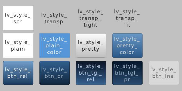
As you can see there is a style for screens, for buttons, plain and pretty styles and transparent styles as well. The lv_style_transp, lv_style_transp_fit and lv_style_transp_tight differ only in paddings: for lv_style_transp_tight all padings are zero, for lv_style_transp_fit only hor and ver paddings are zero.
The built in styles are global lv_style_t variables so you can use them like: lv_btn_set_style(obj, LV_BTN_STYLE_REL, &lv_style_btn_rel)
You can modify the built-in styles or you can create new styles. When creating new styles it is recommended to first copy a built-in style to be sure all fields are initialized with a proper value. The lv_style_copy(&dest_style, &src_style) can be used to copy styles.
Style animations
You can animate styles using lv_style_anim_create(&anim). Before calling this function you have to initialize an lv_style_anim_t variable. The animation will fade a style_1 to style_2.
lv_style_anim_t a;    /*Will be copied, can be local variable*/
a.style_anim = & style_to_anim;     /*Pointer to style to animate*/
a.style_start = & style_1;          /*Pointer to the initial style (only pointer saved) */
a.style_end = & style_2;            /*Pointer to the target style (only pointer saved) */
a.act_time = 0;                     /*Set negative to make a delay*/
a.time = 1000;                      /*Time of animation in milliseconds*/
a.playback = 0;                     /*1: play the animation backward too*/
a.playback_pause = 0;               /*Wait before playback [ms]*/
a.repeat = 0;                       /*1: repeat the animation*/
a.repeat_pause = 0;                 /*Wait before repeat [ms]*/
a.end_cb = NULL;                    /*Call this function when the animation ready*/
Style example
The example below demonstrates the above-described style usage
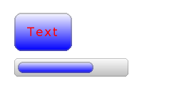
/*Create a style*/
static lv_style_t style1;
lv_style_copy(&style1, &lv_style_plain);    /*Copy a built-in style to initialize the new style*/
style1.body.main_color = LV_COLOR_WHITE;
style1.body.grad_color = LV_COLOR_BLUE;
style1.body.radius = 10;
style1.body.border.color = LV_COLOR_GRAY;
style1.body.border.width = 2;
style1.body.border.opa = LV_OPA_50;
style1.body.padding.hor = 5;            /*Horizontal padding, used by the bar indicator below*/
style1.body.padding.ver = 5;            /*Vertical padding, used by the bar indicator below*/
style1.text.color = LV_COLOR_RED;

/*Create a simple object*/
lv_obj_t *obj1 = lv_obj_create(lv_scr_act(), NULL);
lv_obj_set_style(obj1, &style1);                        /*Apply the created style*/
lv_obj_set_pos(obj1, 20, 20);                           /*Set the position*/

/*Create a label on the object. The label's style is NULL by default*/
lv_obj_t *label = lv_label_create(obj1, NULL);
lv_obj_align(label, NULL, LV_ALIGN_CENTER, 0, 0);       /*Align the label to the middle*/

/*Create a bar*/
lv_obj_t *bar1 = lv_bar_create(lv_scr_act(), NULL);
lv_bar_set_style(bar1, LV_BAR_STYLE_INDIC, &style1);    /*Modify the indicator's style*/
lv_bar_set_value(bar1, 70);                             /*Set the bar's value*/
Themes
To create styles for your GUI is challenging because you need a deeper understanding of the library and you need to have some design skills. In addition, it takes a lot of time to create so many styles.
To speed up the design part themes are introduced. A theme is a style collection which contains the required styles for every object type. For example 5 styles for buttons to describe their 5 possible states. Check the Existing themes.
To be more specific a theme is a structure variable which contains a lot of lv_style_t * fields. For buttons:
theme.btn.rel       /*Released button style*/
theme.btn.pr        /*Pressed button style*/
theme.btn.tgl_rel   /*Toggled released button style*/
theme.btn.tgl_pr    /*Toggled pressed button style*/
theme.btn.ina       /*Inactive button style*/
A theme can initialized by: lv_theme_xxx_init(hue, font). Where xxx is the name of the theme, hue is a Hue value from HSV color space (0..360) and font is the font applied in the theme (NULL to use the LV_FONT_DEFAULT default font)
When a theme is initialized its styles can be used like this:
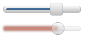
/*Create a default slider*/
lv_obj_t *slider = lv_slider_create(lv_scr_act(), NULL);
lv_slider_set_value(slider, 70);
lv_obj_set_pos(slider, 10, 10);

/*Initialize the alien theme with a redish hue*/
lv_theme_t *th = lv_theme_alien_init(10, NULL);

/*Create a new slider and apply the themes styles*/
slider = lv_slider_create(lv_scr_act(), NULL);
lv_slider_set_value(slider, 70);
lv_obj_set_pos(slider, 10, 50);
lv_slider_set_style(slider, LV_SLIDER_STYLE_BG, th->slider.bg);
lv_slider_set_style(slider, LV_SLIDER_STYLE_INDIC, th->slider.indic);
lv_slider_set_style(slider, LV_SLIDER_STYLE_KNOB, th->slider.knob);
You can ask the library to apply the styles from a theme when you create new objects. To do this use lv_theme_set_current(th);
Input devices
Written for v5.1
To interact with the created object Input devices are required. For example Touchpad, Mouse, Keyboard or even an Encoder. To learn how to add an input device, read the Porting guide.
When you register an input device driver the library adds some extra information to it to describe the state of the input device in more detail. When a user action (e.g. a button press) happens and an action (callback) function is triggered always there is an input device which triggered that action. You can get this input device with
lv_indev_t *indev = lv_indev_get_act();It might be important when you need to know some special information about the input device like the currently pressed point, or dragging an object or not etc.
The input devices have a very simple API:
/*Get the last point on a display input*/
void lv_indev_get_point(lv_indev_t * indev, point_t * point);

/*Check if there is dragging on input device or not */
bool lv_indev_is_dragging(lv_indev_t * indev);

/*Get the vector of dragging on a input device*/
void lv_indev_get_vect(lv_indev_t * indev, point_t * point);

/*Do nothing until the next release*/
void lv_indev_wait_release(lv_indev_t * indev);

/*Do nothing until the next release*/
void lv_indev_wait_release(lv_indev_t * indev);

/*Reset one or all (use NULL) input devices*/
void lv_indev_reset(lv_indev_t * indev);

/*Reset the long pressed state of an input device*/
void lv_indev_reset_lpr(lv_indev_t * indev);

/*Set a cursor for a pointer input device*/
void lv_indev_set_cursor(lv_indev_t * indev, lv_obj_t * cur_obj);

/*Set a destination group for a keypad input device*/
void lv_indev_set_group(lv_indev_t * indev, lv_group_t * group);
Touchpad-less navigation
The objects can be grouped in order to easily control them without touchpad or mouse. It allows you to use
- Keyboard or keypad
- Hardware buttons
- Encoder
to navigate among objects.
Firstly you have to create an object group with lv_group_t *group = lv_group_create() and add objects to it with lv_group_add_obj(group, obj). In a group always there is a focused object. All the button press will be "sent" to the currently focused object.
To navigate among the objects in a group (change the focused object) and interact with them an _LV_INDEV_TYPE_KEYPAD_ typed input device is required. In its read function you can tell the library which key is pressed or released. To learn how to add an input device, read the Porting guide.
Besides you have to assign the group to the input device with
lv_indev_set_group(indev, group)
There are some special control characters which can be used in the read function:
- LV_GROUP_KEY_NEXT Focus on the next object
- LV_GROUP_KEY_PREV Focus on the previous object
- LV_GROUP_KEY_UP Increment the value, move up or click the focused object (move up means e.g. select an upper list element)
- LV_GROUP_KEY_DOWN Decrement the value or move down on the focused object (move down means e.g. select a lower list element)
- LV_GROUP_KEY_RIGHT Increment the value or click the focused object
- LV_GROUP_KEY_LEFT Decrement the value of the focused object
- LV_GROUP_KEY_ENTER Click the focused object or a selected element (e.g. list element)
- LV_GROUP_KEY_ESC Close the object (e.g. drop-down list)
In some cases (e.g. when a pop-up window appears) it is useful to freeze the focus on an object. It means the _LV_GROUP_KEY_NEXT/PREV_ will be ignored. You can do it with lv_group_focus_freeze(group,true).
The style of the focused object is modified by a function. By default, this function is provided by current theme but you can also specify your own style updater function in each group with
void lv_group_set_style_mod_cb(group, style_mod_cb). The _style_mod_cb_ needs an lv_style_t * parameter which is a copy of the focused object's style. In the callback, you can mix some colors to the current ones, and modify parameters but it is not permitted to set attributes which modify the size (like _letter_space_, padding etc.)
Colors
Written for v5.1
The color module handles all color related functions like changing color depth, creating colors from hex code, converting between color depths, mixing colors etc.
The following variable types are defined by the color module:
- lv_color1_t Store monochrome color. For compatibility it also has R,G,B fields but they are always the same (1 byte)
- lv_color8_t A structure to store R (3 bit),G (3 bit),B (2 bit) components for 8 bit colors (1 byte)
- lv_color16_t A structure to store R (5 bit),G (6 bit),B (5 bit) components for 16 bit colors (2 byte)
- lv_color24_t A structure to store R (8 bit),G (8 bit), B (8 bit) components for 24 bit colors (4 byte)
- lv_color_t Equal to color1/8/16/24_t according to color depth settings
- lv_color_int_t uint8_t, uint16_t or uint32_t according to color depth setting. Used to build color arrays from plain numbers.
- lv_opa_t A simple uint8_t type to describe opacity.
The _lv_color_t_, _lv_color1_t__lv_color8_t_, _lv_color16_t_ and _lv_color24_t_ types have got four fields:
- red red channel
- green green channel
- blue blue channel
- full red + green + blue as one number
You can set the current color depth in _lv_conf.h_ by setting the _LV_COLOR_DEPTH_ define to 1 (monochrome), 8, 16 or 24.
You can convert a color from the current color depth to an other. The converter functions return with a number so you have to use the full field:
lv_color_t c;
c.red   = 0x38;
c.green = 0x70;
c.blue  = 0xCC;

lv_color1_t c1;
c1.full = lv_color_to1(c);        /*Return 1 for light colors, 0 for dark colors*/

lv_color8_t c8;
c8.full = lv_color_to8(c);        /*Give a 8 bit number with the converted color*/

lv_color16_t c16;
c16.full = lv_color_to16(c);     /*Give a 16 bit number with the converted color*/

lv_color24_t c24;
c24.full = lv_color_to24(c);    /*Give a 32 bit number with the converted color*/
You can create a color with the current color depth using the LV_COLOR_MAKE macro. It takes 3 arguments (red, green, blue) as 8 bit numbers. For example to create light red color: my_color = COLOR_MAKE(0xFF,0x80,0x80). Colors can be created from HEX codes too: my_color = LV_COLOR_HEX(0xFF8080) or my_color = LV_COLOR_HEX3(0xF88).
Mixing two colors is possible with mixed_color = lv_color_mix(color1, color2, ratio). Ration can be 0..255. 0 results fully color2, 255 result fully color1.
To describe opacity the _lv_opa_t_ type is created as wrapper to _uint8_t_. Some defines are also introduced:
- LV_OPA_TRANSP Value: 0, means the opacity makes the color fully transparent
- LV_OPA_10 Value: 25, means the color covers only a little
- LV_OPA_20 ... OPA_80 come logically
- LV_OPA_90 Value: 229, means the color near fully covers
- LV_OPA_COVER Value: 255, means the color fully covers
You can also use the _LV_OPA_*_ defines in _lv_color_mix() as ratio._
The color module defines the most basic colors:
LV_COLOR_BLACKLV_COLOR_GRAYLV_COLOR_SILVERLV_COLOR_REDLV_COLOR_MARRONLV_COLOR_LIMELV_COLOR_GREENLV_COLOR_OLIVELV_COLOR_BLUELV_COLOR_NAVYLV_COLOR_TAILLV_COLOR_CYANLV_COLOR_AQUALV_COLOR_PURPLELV_COLOR_MAGENTALV_COLOR_ORANGELV_COLOR_YELLOW
as well as LV_COLOR_WHITE.
Fonts
Written for v5.1
In LittlevGL fonts are bitmaps and other descriptors to store the images of the letters (glyph) and some additional information. A font is stored in a lv_font_t variable and can be set it in style's text.font field.
The fonts have a bpp (Bit-Per-Pixel) property. It shows how much bit is used to describe a pixel in the font. The value stored for a pixel determines the pixel's opacity. This way the image of the letters (especially on the edges) can be smooth and even. The possible bpp values are 1, 2, 4 and 8 (higher value means better quality). The bpp also affects the required memory size to store the font. E.g. bpp = 4 makes the font's memory size 4 times greater compared to bpp = 1.
Built-in fonts
There are several built-in fonts which can be enabled in lv_conf.h by _USE_LV_FONT_..._ defines. There are built-in fonts in different sizes:
- 10 px
- 20 px
- 30 px
- 40 px
You can enable the fonts with 1, 2, 4 or 8 values to set its bpp (e.g. #define USE_LV_FONT_DEJAVU_20 4 in lv_conf.h).
The built-in fonts exist with multiply character-sets in each size:
- ASCII (Unicode 32..126)
- Latin supplement (Unicode 160..255)
- Cyrillic (Unicode 1024..1279)
The built-in fonts use the Dejavu font.
The built-in fonts are global variables with names like:
lv_font_dejavu_20(20 px ASCII font)lv_font_dejavu_20_latin_sup(20 px Latin supplement font)lv_font_dejavu_20_cyrillic(20 px Cyrillic font)
Unicode support
The LittlevGL supports Unicode letter from UTF-8 coded characters. You need to configure your editor to save your code/text as UTF-8 (usually this the default) and enable _LV_TXT_UTF8_ in lv_conf.h. Without enabled _LV_TXT_UTF8_ only ASCII fonts and symbols can be used (see the symbols below)
After it the texts will be decoded to determine the Unicode values. To display the letters your font needs to contain the image (glyph) of the characters.
You can assign more fonts to create a larger character-set. To do this choose a base font (typically the ASCII font) and add the extensions to it: lv_font_add(child, parent). Only fonts with the same height can be assigned.
The built-in fonts are already added to the same sized ASCII font. For example if _USE_LV_FONT_DEJAVU_20_ and _USE_LV_FONT_DEJAVU_20_LATIN_SUP_ are enabled in lv_conf.h then the "abcÁÖÜ" text can be rendered when using _lv_font_dejavu_20_.
Symbol fonts
The symbol fonts are special fonts which contain symbols instead of letters. There are built-in symbol fonts as well and they are also assigned to the ASCII font with the same size. In a text, a symbol can be referenced like _SYMBOL_LEFT_, _SYMBOL_RIGHT_ etc. You can mix these symbol names with strings:
lv_label_set_text(label1,"Right "SYMBOL_RIGHT);The symbols can be used without UTF-8 support as well. (_LV_TXT_UTF8 0_)
The list below shows the existing symbols:

Add new font
If you want to add new fonts to the library you can use the Online Font Converter Tool. It can create a C array from a TTF file which can be copied copy to your project. You can specify the height, the range of characters and the bpp. Optionally you can enumerate the characters to include only them into the final font. To use the generated font declare it with _LV_FONT_DECLARE(my_font_name)_. After that, the font can be used as the built-in fonts.
Font example

/*Create a new style for the label*/
static lv_style_t style;
lv_style_copy(&style, &lv_style_plain);
style.text.color = LV_COLOR_BLUE;
style.text.font = &lv_font_dejavu_40;   /*Unicode and symbol fonts already assigned by the library*/

lv_obj_t *label;

/*Use ASCII and Unicode letters*/
label = lv_label_create(lv_scr_act(), NULL);
lv_obj_set_pos(label, 20, 20);
lv_label_set_style(label, &style);
lv_label_set_text(label, "aeuois\n"
                         "äéüöíß");

/*Mix text and symbols*/
label = lv_label_create(lv_scr_act(), NULL);
lv_obj_set_pos(label, 20, 100);
lv_label_set_style(label, &style);
lv_label_set_text(label, "Right "SYMBOL_RIGHT);
Drawing
Written for v5.1
In LittlevGL you can think in graphical objects and don't care about how the drawing happens. You can set the size, position or any attribute of the object an the library will refresh the old (invalid) areas and redraw the new ones. However, you should know the basic drawing methods to know which one you should choose.
Buffered and unbuffered drawing
Unbuffered drawing
The unbuffered drawing puts the pixels directly to the display (frame buffer). Therefore during the drawing process, some flickering might be visible because firstly the background has to be drawn and then the objects on it. For this reason, this type is not suitable when scrolling, dragging and animations are used. On the other hand, it has the smallest memory footprint because no extra graphics buffer is required.
To use unbuffered drawing set _LV_VDB_SIZE_ to 0 in _lv_conf.h_ and register the _disp_map_ and _disp_fill_functions. Here you can learn more about Porting.
Buffered drawing
The buffered drawing is similar to double buffering when two screen sized buffers are used (one for rendering and an other to display the last ready frame). However, LittlevGL's buffered drawing algorithm uses only one frame buffer and a small graphical buffer called Virtual Display Buffer (VDB). For VDB size ~1/10 screen size is typically enough. For a 320 × 240 screen with 16-bit colors, it means only 15 kB extra RAM.
With buffered drawing there is no flickering because the image is created firstly in the memory (VDB), therefore scrolling, dragging and animations can be used. In addition, it enables the use of other graphical effects like anti-aliasing, transparency (opacity) and shadows.
To use buffered drawing set _LV_VDB_SIZE_ to > LV_HOR_RES in _lv_conf.h_ and register a _disp_flush_ function.
In buffered mode, you can use double VDB to parallelly execute rendering into one VDB and copying pixels to your frame buffer from an other. The copy should use DMA or other hardware acceleration to work in the background to let the CPU to do other things. In _lv_conf.h_ the _LV_VDB_DOUBLE 1_ enables this feature.
Buffered vs Unbuffered drawing
Keep in mind it's not sure that the unbuffered drawing is faster. During the rendering process, a pixel is overwritten multiple times (e.g. background, button, text are above each other). This way in unbuffered mode the library needs to access the external memory or display controller several times which is slower than writing/reading the internal RAM.
The following table summarizes the differences between the two drawing methods:
| Unbuffered drawing | Buffered drawing | |
|---|---|---|
| Memory usage | No extra | >~1/10 screen |
| Quality | Flickering | Flawless |
| Antialiasing | Not supported | Supported |
| Transparency | Not supported | Supported |
| Shadows | Not supported | Supported |
Anti-aliasing
In lv_conf.h you can enable the anti-aliasing with _LV_ANTIALIAS 1_. The anti-aliasing is supported only in buffered mode (LV_VDB_SIZE > LV_HOR_RES).
The anti-aliasing algorithm puts some translucent pixels (pixels with opacity) to make lines and curves (including corners with radius) smooth and even. Because it only puts some extra pixels anti-aliasing requires only a few extra computational power(~1,1x extra time compared to not anti-aliased configuration)
As described in Font section the fonts can be anti-aliased by using a different font with higher bpp (Bit-Per-Pixel). This way the pixels of a font can be not only 0 or 1 but can be translucent. The supported bpp-s are 1, 2, 4 and 8. Keep in mind a font with higher bpp requires more ROM.
Animations
Written for v5.1
You can automatically change the value (animate) of a variable between a start and an end value using an animator function with void func(void* var,int32_t value) prototype. The animation will happen by the periodical calling of the animator function with the corresponding value parameter.
To create an animation you have to initializes an _lv_anim_t_ variable (there is a template in lv_anim.h):
lv_anim_t a;
a.var = button1;                             /*Variable to animate*/
a.start = 100;                                 /*Start value*/
a.end = 300;                                 /*End value*/
a.fp = (lv_anim_fp_t)lv_obj_set_height;                                 /*Function to be used to animate*/
a.path = lv_anim_path_linear;                                            /*Path of animation*/
a.end_cb = NULL;                               /*Callback when the animation is ready*/
a.act_time = 0;                                 /*Set < 0 to make a delay [ms]*/
a.time = 200;                                 /*Animation length [ms]*/
a.playback = 0;                                 /*1: animate in reverse direction too when the normal is ready*/
a.playback_pause = 0;                                 /*Wait before playback [ms]*/
a.repeat = 0;                                 /*1: Repeat the animation (with or without playback)*/
a.repeat_pause = 0;                             /*Wait before repeat [ms]*/

lv_anim_create(&a);                          /*Start the animation*/
The anim_create(&a) will register the animation and immediately applies the start value regardless to the set delay.
You can determinate the path of animation. In most simple case it is linear which means the current value between start and end is changed linearly. A path is a function which calculates the next value to set based on the current state of the animation. Currently, there are two built-in paths:
- lv_anim_path_linear linear animation
- lv_anim_path_step change in one step at the end
By default, you can set the animation time. But in some cases, the animation speed is more practical. The lv_anim_speed_to_time(speed, start, end) function calculates the required time in milliseconds to reach the end value from a start value with the given speed. The speed is interpreted in unit/sec dimension. For example lv_anim_speed_to_time(20,0,100) will give 5000 milliseconds.
You can apply multiple different animations on the same variable at the same time. (For example animate the x and y coordinates with _lv_obj_set_x_ end _lv_obj_set_y_). But only one animation can exist with a given variable and function pair. Therefore the _lv_anim_create()_ function will delete the already existing variable-function animations.
You can delete an animation by lv_anim_del(var, func) with providing the animated variable and its animator function.
Coding Style Guide
Revision 2
File format
Use lv_misc/lv_templ.c and lv_misc/lv_templ.h
Naming conventions
- Words are separated by '_'
- In variable and function names use only lower case letters (e.g. height_tmp)
- In enums and defines use only upper case letters (e.g. e.g. MAX_LINE_NUM)
- Global names (API):
- starts with lv
- followed by module name: btn, label, style etc.
- followed by the action (for functions): set, get, refr etc.
- closed with the subject: name, size, state etc.
- Typedefs
- prefer
typedef structandtypedef enuminstead ofstruct nameandenum name - always end
typedef structandtypedef enumtype names with_t
- prefer
- Abbreviations:
- Use abbreviations on public names only if they become longer than 32 characters
- Use only very straightforward (e.g. pos: position) or well-established (e.g. pr: press) abbreviations
Coding guide
- Functions:
- Try to write function shorter than is 50 lines
- Always shorter than 100 lines (except very straightforwards)
- Variables:
- One line, one declaration (BAD: char x, y;)
- Use
<stdint.h>(uint8_t, int32_t etc) - Declare variables when needed (not all at function start)
- Use the smallest required scope
- Variables in a file (outside functions) are always static
- Do not use global variables (use functions to set/get static variables)
Comments
Before every function have a comment like this:
/**
 * Return with the screen of an object
 * @param obj pointer to an object
 * @return pointer to a screen
 */
lv_obj_t * lv_obj_get_scr(lv_obj_t * obj);
Always use /* Something */ format and NOT //Something
Write readable code to avoid descriptive comments like:
x++; /* Add 1 to x */.
The code should show clearly what you are doing.
You should write why have you done this:
x++; /*Because of closing '\0' of the string */
Short "code summaries" of a few lines are accepted. E.g. /*Calculate the new coordinates*/
In comments use ` ` when referring to a variable. E.g. /*Update the value of `x_act`*/
Formatting
Here is example to show bracket placing and using of white spaces:
/**
 * Set a new text for a label. Memory will be allocated to store the text by the label.
 * @param label pointer to a label object
 * @param text '\0' terminated character string. NULL to refresh with the current text.
 */
void lv_label_set_text(lv_obj_t * label, const char * text)
{   /* Main brackets of functions in new line*/

    if(label == NULL) return; /*No bracket only if the command is inline with the if statement*/

    lv_obj_inv(label);

    lv_label_ext_t * ext = lv_obj_get_ext(label);

    /*Comment before a section */
    if(text == ext->txt || text == NULL) {  /*Bracket of statements start inline*/
        lv_label_refr_text(label);
        return;
    }

    ...
}
Use 4 spaces indentation instead of tab.
You can use astyle to format the code. The required config flies are: docs/astyle_c and docs/astyle_h.
To format the source files:
$ find . -type f -name "*.c" | xargs astyle --options=docs/astyle_c
To format the header files:
$ find . -type f -name "*.h" | xargs astyle --options=docs/astyle_h
Append -n to the end to skip creation of backup file OR use $ find . -type f -name "*.bak" -delete (for source file's backups) and find . -type f -name "*.orig" -delete (for header file's backups)
Object types
Written for v5.1
The following pages contain detailed documentation for each of the objects in the Littlev Graphics Library.
- Base object (lv_obj)
- Label (lv_label)
- Image (lv_img)
- Line (lv_line)
- Arc (lv_arc)
- Container (lv_cont)
- Page (lv_page)
- Window (lv_window)
- Tab view (lv_tabview)
- Bar (lv_bar)
- Line meter (lv_lmeter)
- Gauge (lv_gauge)
- Chart (lv_chart)
- LED (lv_led)
- Preloader (lv_preload)
- Message box (lv_mbox)
- Text area (lv_ta)
- Calendar (lv_calendar)
- Button (lv_btn)
- Image button (lv_imgbtn)
- Button matrix (lv_btnm)
- Keyboard (lv_kb)
- List (lv_list)
- Drop down list (lv_ddlist)
- Roller (lv_roller)
- Check box (lv_cb)
- Switch (lv_sw)
- Slider (lv_slider)
Arc (lv_arc)
Written for v5.2
Overview
The Arc object draws an arc within start and end angles and with a given thickness.
To set the angles use the lv_arc_set_angles(arc, start_angle, end_angle) function. The zero degree is at the bottom of the object and the degrees are increasing in a counter-clockwise direction. The angles should be in [0;360] range.
To set the style of an Arc object use lv_arc_set_style(arc, LV_ARC_STYLE_MAIN, &style)
Style usage
- line.rounded make the endpoints rounded (opacity won't work properly if set to 1)
- line.width the thickness of the arc
- line.color the color of the arc.
Notes
- The width and height of the Arc should be the same
- Currently the Arc object does not support anti-aliasing.
Example

/*Create style for the Arcs*/
lv_style_t style;
lv_style_copy(&style, &lv_style_plain);
style.line.color = LV_COLOR_BLUE;           /*Arc color*/
style.line.width = 8;                       /*Arc width*/

/*Create an Arc*/
lv_obj_t * arc = lv_arc_create(lv_scr_act(), NULL);
lv_arc_set_style(arc, LV_ARC_STYLE_MAIN, &style);          /*Use the new style*/
lv_arc_set_angles(arc, 90, 60);
lv_obj_set_size(arc, 150, 150);
lv_obj_align(arc, NULL, LV_ALIGN_CENTER, 0, 0);

/*Copy the previous Arc and set different angles and size*/
arc = lv_arc_create(lv_scr_act(), arc);
lv_arc_set_angles(arc, 90, 20);
lv_obj_set_size(arc, 125, 125);
lv_obj_align(arc, NULL, LV_ALIGN_CENTER, 0, 0);

/*Copy the previous Arc and set different angles and size*/
arc = lv_arc_create(lv_scr_act(), arc);
lv_arc_set_angles(arc, 90, 310);
lv_obj_set_size(arc, 100, 100);
lv_obj_align(arc, NULL, LV_ALIGN_CENTER, 0, 0);
Bar (lv_bar)
Written for v5.1
Overview
The Bar objects have got two main parts: a background which is the object itself and an indicator which shape is similar to the background but its width/height can be adjusted.
The orientation of the bar can be vertical or horizontal according to the width/height ratio. Logically on horizontal bars the indicator width, on vertical bars the indicator height can be changed.
A new value can be set by: lv_bar_set_value(bar, new_value). The value is interpreted in range (minimum and maximum values) which can be modified with: lv_bar_set_range(bar, min, max). The default range is: 1..100.
The setting of a new value can happen with an animation from the current value to the desired. In this case use lv_bar_set_value_anim(bar, new_value, anim_time).
Style usage
- background is a Base objecttherefore it uses its style elements. Its default style is:
LV_STYLE_PRETTY. - indicator is similar to the background. Its styles can be set by:
lv_bar_set_style_indic(bar,&style_indic). It uses the hpad and vpad style elements to keep space from the background. Its default style is:LV_STYLE_PRETTY_COLOR.
Notes
- The indicator is not a real object; it is only drawn by the bar.
Example
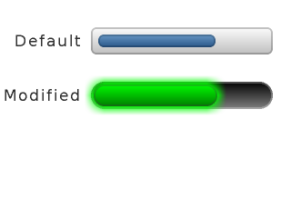
/*Create a default bar*/
lv_obj_t * bar1 = lv_bar_create(lv_scr_act(), NULL);
lv_obj_set_size(bar1, 200, 30);
lv_obj_align(bar1, NULL, LV_ALIGN_IN_TOP_RIGHT, -20, 30);
lv_bar_set_value(bar1, 70);

/*Create a label right to the bar*/
lv_obj_t * bar1_label = lv_label_create(lv_scr_act(), NULL);
lv_label_set_text(bar1_label, "Default");
lv_obj_align(bar1_label, bar1, LV_ALIGN_OUT_LEFT_MID, -10, 0);

/*Create a bar and an indicator style*/
static lv_style_t style_bar;
static lv_style_t style_indic;

lv_style_copy(&style_bar, &lv_style_pretty);
style_bar.body.main_color = LV_COLOR_BLACK;
style_bar.body.grad_color = LV_COLOR_GRAY;
style_bar.body.radius = LV_RADIUS_CIRCLE;
style_bar.body.border.color = LV_COLOR_WHITE;

lv_style_copy(&style_indic, &lv_style_pretty);
style_indic.body.grad_color =  LV_COLOR_GREEN;
style_indic.body.main_color=  LV_COLOR_LIME;
style_indic.body.radius = LV_RADIUS_CIRCLE;
style_indic.body.shadow.width = 10;
style_indic.body.shadow.color = LV_COLOR_LIME;
style_indic.body.padding.hor = 3;           /*Make the indicator a little bit smaller*/
style_indic.body.padding.ver = 3;

/*Create a second bar*/
lv_obj_t * bar2 = lv_bar_create(lv_scr_act(), bar1);
lv_bar_set_style(bar2, LV_BAR_STYLE_BG, &style_bar);
lv_bar_set_style(bar2, LV_BAR_STYLE_INDIC, &style_indic);
lv_obj_align(bar2, bar1, LV_ALIGN_OUT_BOTTOM_MID, 0, 30); /*Align below 'bar1'*/

/*Create a second label*/
lv_obj_t * bar2_label = lv_label_create(lv_scr_act(), bar1_label);
lv_label_set_text(bar2_label, "Modified");
lv_obj_align(bar2_label, bar2, LV_ALIGN_OUT_LEFT_MID, -10, 0);
Base object (lv_obj)
Written for v5.1
Overview
The Base Object contains the most basic attributes of the objects:
- Coordinates
- Parent object
- Children
- Style
- Attributes like Click enable, Drag enable etc.
You can set the x and y coordinates relative to the parent with lv_obj_set_x(obj, new_x) and lv_obj_set_y(obj, new_y) or in one function with lv_obj_set_pos(obj, new_x, new_y).
The object size can be modified with lv_obj_set_width(obj, new_width) and lv_obj_set_height(obj, new_height) or in one function with lv_obj_set_size(obj, new_width, new_height).
Note that these functions only work for objects with a parent. Screens do not have a parent, and attempting to use these functions will result in undefined behavior.
You can align the object to an other with lv_obj_align(obj1, obj2, LV_ALIGN_TYPE, x_shift, y_shift). The last two argument means an x and y shift after the alignment. The second argument is another object on which to align the first (NULL means: align to the parent). The third argument is the type of alignment:
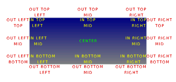
The alignment types build like: LV_ALIGN_OUT_TOP_MID. For example to align a text below an image: lv_obj_align(text, image, LV_ALIGN_OUT_BOTTOM_MID, 0, 10). Or to align a text in the middle of its parent: lv_obj_align(text, NULL, LV_ALIGN_CENTER, 0, 0).
You can set a new parent for an object with lv_obj_set_parent(obj, new_parent).
To get the children of an object use lv_obj_get_child(obj, child_prev) (from last to first) or lv_obj_get_child_back(obj, child_prev) (from first to last). To get the first child pass NULL as the second parameter and then the previous child (return value). The function will return with NULL when there are no more children.
When you have created a screen like lv_obj_create(NULL, NULL) you can load it with lv_scr_load(screen1). The lv_scr_act() function gives you a pointer to the current screen.
There are two layers automatically generated layers:
- top layer
- system layer
They are independent of the screens so objects created an that layers will be shown on every screen. The top layer is above every object on the screen and system layer is above top layer too. You can add any pop-up windows top layer freely. But the system layer restricted to system level things (e.g. mouse cursor will be moved here). The lv_layer_top() and lv_layer_sys() functions gives a pointer to the top or system layer.
You can set a new style for an object with the lv_obj_set_style(obj, &new_style) function. If NULL is set as style then the object will inherit its parent's style. If you modify a style you have to notify the objects who are using the modified styled. You can use either lv_obj_refresh_style(obj) or to notify all object with a given style lv_obj_report_style_mod(&style). Set _lv_obj_report_style_mod_'s parameter to NULL to notify all objects.
There are some attributes which can be enabled/disabled by lv_obj_set_...(obj, true/false):
- hidden Hide the object. It will not be drawn and won't occupy space, Its children will be hidden too.
- click Enabled to click the object via an input device (e.g. touch pad). If disabled then object behind this one will be checked during the input device click handling (useful with typically not clickable objects like Labels)
- top If enabled then when this object or any of its children is clicked then this object comes to the foreground.
- drag Enable dragging (moving by an input device)
- drag_throw Enable "throwing" with dragging like the object would have momentum
- drag_parent If enabled then the object's parent will be moved during dragging.
There are some specific actions which happen automatically in the library. To prevent one or more that kind of actions you can protect the object against them. The following protections exists:
- LV_PROTECT_NONE No protection
- LV_PROTECT_POS Prevent automatic positioning (e.g. Layout in lv_cont)
- LV_PROTECT_FOLLOW Prevent the object be followed in automatic ordering (e.g. Layout in lv_cont)
- LV_PROTECT_PARENT Prevent automatic parent change
- LV_PROTECT_CHILD_CHG Disable the child change signal. Used by the library
The lv_obj_set/clr_protect(obj, LV_PROTECT_...) sets/clears the protection. You can use 'OR'ed values of protection types too.
There are built-in animations for the objects. The following animation types exist:
- LV_ANIM_FLOAT_TOP Float from/to the top
- LV_ANIM_FLOAT_LEFT Float from/to the left
- LV_ANIM_FLOAT_BOTTOM Float from/to the bottom
- LV_ANIM_FLOAT_RIGHT Float from/to the right
- LV_ANIM_GROW_H Grow/shrink horizontally
- LV_ANIM_GROW_V Grow/shrink vertically
The lv_obj_animate(obj, anim_type, time, delay, callback) applies an animation on obj. To determinate the direction of the animation _OR_ _ANIM_IN_ or _ANIM_OUT_ with the animation type. The default is _ANIM_IN_ if not specified. You can learn more about the animations.
Style usage
All style.body properties are used. Default for screens _lv_style_plain_ and _lv_style_plain_color_ for normal objects
Example
/*Create a simple base object*/
lv_obj_t * obj1;
obj1 = lv_obj_create(lv_scr_act(), NULL);
lv_obj_set_size(obj1, 150, 40);
lv_obj_set_style(obj1, &lv_style_plain_color);
lv_obj_align(obj1, NULL, LV_ALIGN_IN_TOP_MID, 0, 40);

/*Copy the previous object and enable drag*/
lv_obj_t * obj2;
obj2 = lv_obj_create(lv_scr_act(), obj1);
lv_obj_set_style(obj2, &lv_style_pretty_color);
lv_obj_set_drag(obj2, true);
lv_obj_align(obj2, NULL, LV_ALIGN_CENTER, 0, 0);

static lv_style_t style_shadow;
lv_style_copy(&style_shadow, &lv_style_pretty);
style_shadow.body.shadow.width = 6;
style_shadow.body.radius = LV_RADIUS_CIRCLE;

/*Copy the previous object (drag is already enabled)*/
lv_obj_t * obj3;
obj3 = lv_obj_create(lv_scr_act(), obj2);
lv_obj_set_style(obj3, &style_shadow);
lv_obj_align(obj3, NULL, LV_ALIGN_IN_BOTTOM_MID, 0, -40);
Button (lv_btn)
Written for v5.1, revision 2
Overview
Buttons can react on user press, release or long press via callback functions (lv_action_t function pointers). You can set the callback functions with: lv_btn_set_action(btn, ACTION_TYPE, callback_func). The possible action types are:
- LV_BTN_ACTION_CLICK: the button is released after pressing (clicked) or, when using keypad, after the key
LV_GROUP_KEY_ENTERis released - LV_BTN_ACTION_PR: the button is pressed
- LV_BTN_ACTION_LONG_PR: the button is long pressed
- LV_BTN_ACTION_LONG_PR_REPEAT: the button is long pressed and this action is triggered periodically
Buttons can be in one of the five possible states:
- LV_BTN_STATE_REL Released state
- LV_BTN_STATE_PR Pressed state
- LV_BTN_STATE_TGL_REL Toggled released state (On state)
- LV_BTN_STATE_TGL_PR Toggled pressed state (On pressed state)
- LV_BTN_STATE_INA Inactive state
The buttons can be configured as toggle button with lv_btn_set_toggle(btn, true). In this case on release, the button goes to toggled released state.
You can set the button's state manually by: lv_btn_set_state(btn, LV_BTN_STATE_TGL_REL).
A button can go to Inactive state only manually (by _lv_btn_set_state()_). In an Inactive state, none of the action will be called.
Similarly to Containers buttons also have layout and auto fit:
lv_btn_set_layout(btn, LV_LAYOUT_...)set a layout. The default is LV_LAYOUT_CENTER. So if you add a label then it will be automatically aligned to the middle.lv_btn_set_fit(btn, hor_en, ver_en)enables to set the button width and/or height automatically according to the children.
Style usage
A button can have 5 independent styles for the 5 state. You can set them via: lv_btn_set_style(btn, LV_BTN_STYLE_..., &style). The styles use the style.body properties.
- LV_BTN_STYLE_REL style of the released state. Default: _lv_style_btn_rel_
- LV_BTN_STYLE_PR style of the pressed state. Default: _lv_style_btn_pr_
- LV_BTN_STYLE_TGL_REL style of the toggled released state. Default: _lv_style_btn_tgl_rel_
- LV_BTN_STYLE_TGL_PR style of the toggled pressed state. Default: _lv_style_btn_tgl_pr_
- LV_BTN_STYLE_INA style of the inactive state. Default: _lv_style_btn_ina_
Notes
- If a button is dragged its click and long press action will not be called
- If a button was long pressed and its long press action was set then its click action will not be called
Example
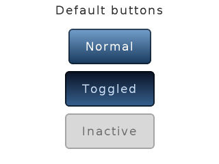
static lv_res_t btn_click_action(lv_obj_t * btn)
{
    uint8_t id = lv_obj_get_free_num(btn);

    printf("Button %d is released\n", id);

    /* The button is released.
     * Make something here */

    return LV_RES_OK; /*Return OK if the button is not deleted*/
}

.
.
.

/*Create a title label*/
lv_obj_t * label = lv_label_create(lv_scr_act(), NULL);
lv_label_set_text(label, "Default buttons");
lv_obj_align(label, NULL, LV_ALIGN_IN_TOP_MID, 0, 5);

/*Create a normal button*/
lv_obj_t * btn1 = lv_btn_create(lv_scr_act(), NULL);
lv_cont_set_fit(btn1, true, true); /*Enable resizing horizontally and vertically*/
lv_obj_align(btn1, label, LV_ALIGN_OUT_BOTTOM_MID, 0, 10);
lv_obj_set_free_num(btn1, 1);   /*Set a unique number for the button*/
lv_btn_set_action(btn1, LV_BTN_ACTION_CLICK, btn_click_action);

/*Add a label to the button*/
label = lv_label_create(btn1, NULL);
lv_label_set_text(label, "Normal");

/*Copy the button and set toggled state. (The release action is copied too)*/
lv_obj_t * btn2 = lv_btn_create(lv_scr_act(), btn1);
lv_obj_align(btn2, btn1, LV_ALIGN_OUT_BOTTOM_MID, 0, 10);
lv_btn_set_state(btn2, LV_BTN_STATE_TGL_REL);  /*Set toggled state*/
lv_obj_set_free_num(btn2, 2);               /*Set a unique number for the button*/

/*Add a label to the toggled button*/
label = lv_label_create(btn2, NULL);
lv_label_set_text(label, "Toggled");

/*Copy the button and set inactive state.*/
lv_obj_t * btn3 = lv_btn_create(lv_scr_act(), btn1);
lv_obj_align(btn3, btn2, LV_ALIGN_OUT_BOTTOM_MID, 0, 10);
lv_btn_set_state(btn3, LV_BTN_STATE_INA);   /*Set inactive state*/
lv_obj_set_free_num(btn3, 3);               /*Set a unique number for the button*/

/*Add a label to the inactive button*/
label = lv_label_create(btn3, NULL);
lv_label_set_text(label, "Inactive");
Button matrix (lv_btnm)
Written for v5.1
Overview
The Button Matrix objects can display multiple buttons according to a descriptor string array, called map. You can specify the map with lv_btnm_set_map(btnm, my_map).
The declaration of a map looks like const char * map[] = {"btn1", "btn2", "btn3", ""}. Note that the last element has to be an empty string!
The first character of a string can be a control character to specify some attributes:
- bit 7..6 Always 0b10 to differentiate the control byte from the textual characters
- bit 5 Inactive button
- bit 4 No long press for the button
- bit 3 Hidden button
- bit 2..0 Relative width compared to the buttons in the same row. [1..7]
It is recommended to specify the control byte as an octal number. For example "\213button". The octal number always starts with _2_ (bit 7..6) the middle part is the attributes (bit 5..3) and the last part is the width (bit 2..0). So the example describes a 3 unit wide, hidden button.
Use "\n" in the map to make line break: {"btn1", "btn2", "\n", "btn3", ""}. The button's width is recalculated in every line.
The lv_btnm_set_action(btnm, btnm_action) specifies an action to call when a button is released.
You can enable the buttons to toggle when they are clicked. There can only be one toggled button at a time. The lv_btnm_set_toggle(btnm, true, id) enables the toggling and sets the _id_th button to the toggled state.
Style usage
The Button matrix works with 6 styles: a background and 5 button styles for each states. You can set the styles with lv_btnm_set_style(btn, LV_BTNM_STYLE_..., &style). The background and the buttons use the style.body properties. The labels use the style.text properties of the button styles.
- LV_BTNM_STYLE_BG Background style. Uses all style.body properties including padding Default: _lv_style_pretty_
- LV_BTNM_STYLE_BTN_REL style of the released buttons. Default: _lv_style_btn_rel_
- LV_BTNM_STYLE_BTN_PR style of the pressed buttons. Default: _lv_style_btn_pr_
- LV_BTNM_STYLE_BTN_TGL_REL style of the toggled released buttons. Default: _lv_style_btn_tgl_rel_
- LV_BTNM_STYLE_BTN_TGL_PR style of the toggled pressed buttons. Default: _lv_style_btn_tgl_pr_
- LV_BTNM_STYLE_BTN_INA style of the inactive buttons. Default: _lv_style_btn_ina_
Notes
- The Button matrix object is very light weighted. It creates only the Background Base object and draws the buttons on it instead of creating a lot of real button.
Example

/*Called when a button is released ot long pressed*/
static lv_res_t btnm_action(lv_obj_t * btnm, const char *txt)
{
    printf("Button: %s released\n", txt);

    return LV_RES_OK; /*Return OK because the button matrix is not deleted*/
}


.
.
.

/*Create a button descriptor string array*/
static const char * btnm_map[] = {"1", "2", "3", "4", "5", "\n",
                           "6", "7", "8", "9", "0", "\n",
                           "\202Action1", "Action2", ""};


/*Create a default button matrix*/
lv_obj_t * btnm1 = lv_btnm_create(lv_scr_act(), NULL);
lv_btnm_set_map(btnm1, btnm_map);
lv_btnm_set_action(btnm1, btnm_action);
lv_obj_set_size(btnm1, LV_HOR_RES, LV_VER_RES / 2);

/*Create a new style for the button matrix back ground*/
static lv_style_t style_bg;
lv_style_copy(&style_bg, &lv_style_plain);
style_bg.body.main_color = LV_COLOR_SILVER;
style_bg.body.grad_color = LV_COLOR_SILVER;
style_bg.body.padding.hor = 0;
style_bg.body.padding.ver = 0;
style_bg.body.padding.inner = 0;

/*Create 2 button styles*/
static lv_style_t style_btn_rel;
static lv_style_t style_btn_pr;
lv_style_copy(&style_btn_rel, &lv_style_btn_rel);
style_btn_rel.body.main_color = LV_COLOR_MAKE(0x30, 0x30, 0x30);
style_btn_rel.body.grad_color = LV_COLOR_BLACK;
style_btn_rel.body.border.color = LV_COLOR_SILVER;
style_btn_rel.body.border.width = 1;
style_btn_rel.body.border.opa = LV_OPA_50;
style_btn_rel.body.radius = 0;

lv_style_copy(&style_btn_pr, &style_btn_rel);
style_btn_pr.body.main_color = LV_COLOR_MAKE(0x55, 0x96, 0xd8);
style_btn_pr.body.grad_color = LV_COLOR_MAKE(0x37, 0x62, 0x90);
style_btn_pr.text.color = LV_COLOR_MAKE(0xbb, 0xd5, 0xf1);

/*Create a second button matrix with the new styles*/
lv_obj_t * btnm2 = lv_btnm_create(lv_scr_act(), btnm1);
lv_btnm_set_style(btnm2, LV_BTNM_STYLE_BG, &style_bg);
lv_btnm_set_style(btnm2, LV_BTNM_STYLE_BTN_REL, &style_btn_rel);
lv_btnm_set_style(btnm2, LV_BTNM_STYLE_BTN_PR, &style_btn_pr);
lv_obj_align(btnm2, btnm1, LV_ALIGN_OUT_BOTTOM_MID, 0, 0);
Calendar (lv_calendar)
Written for v5.2
Overview
The Calendar object is a classic calendar which can:
- highlight the current day and week
- highlight any user-defined dates
- display the name of the days
- go the next/previous month by button click
The set and get dates in the calendar the lv_calendar_date_t type is used which is a structure with year, month and day fields.
To set the current date use the lv_calendar_set_today_date(calendar, &today_date) function.
To set the shown date use lv_calendar_set_shown_date(calendar, &shown_date);
The list of highlighted dates should be stired in a lv_calendar_date_t array and passed this array can be passed to lv_calendar_set_hoghlighted_dates(calendar, &highlighted_dates).
Only the arrays pointer will be saved so the array should be a static or global variable.
The name of the days can be adjusted with lv_calendar_set_day_names(calendar, day_names) where day_names looks like const char * day_names[7] = {"Su", "Mo", ...};
Aaction to select a date will be supported in v5.3 and now available in the dev-5.3 branch for experimental usage.
Style usage
- LV_CALENDAR_STYLE_BG Style of the background using the
bodyproperties and the style of the data numbers using thetextproperties. - LV_CALENDAR_STYLE_HEADER Style of the header where the current year and month is displayed.
bodyandtextproperties are used. - LV_CALENDAR_STYLE_HEADER_PR Pressed header style, used when the next/prev. month button is being pressed.
textproperties are used by the arrows. - LV_CALENDAR_STYLE_DAY_NAMES Style of the day names.
textproperties are used by the day texts andbody.padding.verdetermines the space above the day names. - LV_CALENDAR_STYLE_HIGHLIGHTED_DAYS
textproperties are used to adjust the style of the highlights days - LV_CALENDAR_STYLE_INACTIVE_DAYS
textproperties are used to adjust the style of the visible days of previous/next month. - LV_CALENDAR_STYLE_WEEK_BOX
bodyproperties are used to set the style of the week box - LV_CALENDAR_STYLE_TODAY_BOX
bodyandtextproperties are used to set the style of the today box
Example
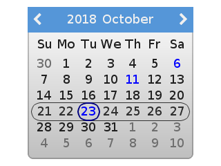
/*Create a Calendar object*/
lv_obj_t * calendar = lv_calendar_create(lv_scr_act(), NULL);
lv_obj_set_size(calendar, 240, 220);
lv_obj_align(calendar, NULL, LV_ALIGN_CENTER, 0, 0);

/*Create a style for the current week*/
static lv_style_t style_week_box;
lv_style_copy(&style_week_box, &lv_style_plain);
style_week_box.body.border.width = 1;
style_week_box.body.border.color = LV_COLOR_HEX3(0x333);
style_week_box.body.empty = 1;
style_week_box.body.radius = LV_RADIUS_CIRCLE;
style_week_box.body.padding.ver = 3;
style_week_box.body.padding.hor = 3;

/*Create a style for today*/
static lv_style_t style_today_box;
lv_style_copy(&style_today_box, &lv_style_plain);
style_today_box.body.border.width = 2;
style_today_box.body.border.color = LV_COLOR_NAVY;
style_today_box.body.empty = 1;
style_today_box.body.radius = LV_RADIUS_CIRCLE;
style_today_box.body.padding.ver = 3;
style_today_box.body.padding.hor = 3;
style_today_box.text.color= LV_COLOR_BLUE;

/*Create a style for the highlighted days*/
static lv_style_t style_highlighted_day;
lv_style_copy(&style_highlighted_day, &lv_style_plain);
style_highlighted_day.body.border.width = 2;
style_highlighted_day.body.border.color = LV_COLOR_NAVY;
style_highlighted_day.body.empty = 1;
style_highlighted_day.body.radius = LV_RADIUS_CIRCLE;
style_highlighted_day.body.padding.ver = 3;
style_highlighted_day.body.padding.hor = 3;
style_highlighted_day.text.color= LV_COLOR_BLUE;

/*Apply the styles*/
lv_calendar_set_style(calendar, LV_CALENDAR_STYLE_WEEK_BOX, &style_week_box);
lv_calendar_set_style(calendar, LV_CALENDAR_STYLE_TODAY_BOX, &style_today_box);
lv_calendar_set_style(calendar, LV_CALENDAR_STYLE_HIGHLIGHTED_DAYS, &style_highlighted_day);


/*Set the today*/
lv_calendar_date_t today;
today.year = 2018;
today.month = 10;
today.day = 23;

lv_calendar_set_today_date(calendar, &today);
lv_calendar_set_showed_date(calendar, &today);

/*Highlight some days*/
static lv_calendar_date_t highlihted_days[3];       /*Only it's pointer will be saved so should be static*/
highlihted_days[0].year = 2018;
highlihted_days[0].month = 10;
highlihted_days[0].day = 6;

highlihted_days[1].year = 2018;
highlihted_days[1].month = 10;
highlihted_days[1].day = 11;

highlihted_days[2].year = 2018;
highlihted_days[2].month = 11;
highlihted_days[2].day = 22;

lv_calendar_set_highlighted_dates(calendar, highlihted_days, 3);
Chart (lv_chart)
Written for v5.1
Overview
Charts have a rectangle-like background with horizontal and vertical division lines. You can add any number of series to the charts by lv_chart_add_series(chart, color). It allocates data for a lv_chart_series_t structure which contains the chosen color and an array for the data.
You have several options to set the data of series:
- Set the values manually in the array like
ser1->points[3] = 7and refresh the chart withlv_chart_refresh(chart). - Use the
lv_chart_set_next(chart, ser, value)function to shift all data to left and set a new data on the most right position. - Initialize all points to a given value with:
lv_chart_init_points(chart, ser, value). - Set all points from an array with:
lv_chart_set_points(chart, ser, value_array).
There are four data display types:
- LV_CHART_TYPE_NONE: do not display the points. It can be used if you would like to add your own draw method.
- LV_CHART_TYPE_LINE: draw lines between the points
- LV_CHART_TYPE_COL: Draw columns
- LV_CHART_TYPE_POINT: Draw points
You can specify the display type with lv_chart_set_type(chart, TYPE). The LV_CHART_TYPE_LINE | LV_CHART_TYPE_POINT type is also valid to draw both lines and points.
You can specify a the min. and max. values in y directions with lv_chart_set_range(chart, y_min, y_max). The value of the points will be scaled proportionally. The default range is: 0..100.
The number of points in the data lines can be modified by lv_chart_set_point_count(chart, point_num). The default value is 10.
The number of horizontal and vertical division lines can be modified by lv_chart_set_div_line_count(chart, hdiv_num, vdiv_num). The default settings are 3 horizontal and 5 vertical division lines.
To set the line width and point radius use the lv_chart_set_series_width(chart, size) function. The default value is: 2.
The *opacity of the data lines can be specified by lv_chart_set_series_opa(chart, opa). The default value is: OPA_COVER.
You can apply a dark color fade on the bottom of columns and points by lv_chart_set_series_darking(chart, effect) function. The default dark level is OPA_50.
Style usage
- style.body properties set the background's appearance
- style.line properties set the division lines' appearance
The series related parameters can be set directly for each chart with lv_chart_set_series_width(), lv_chart_set_series_opa() and lv_chart_set_series_dark().
Example
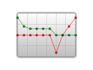
/*Create a style for the chart*/
static lv_style_t style;
lv_style_copy(&style, &lv_style_pretty);
style.body.shadow.width = 6;
style.body.shadow.color = LV_COLOR_GRAY;
style.line.color = LV_COLOR_GRAY;

/*Create a chart*/
lv_obj_t * chart;
chart = lv_chart_create(lv_scr_act(), NULL);
lv_obj_set_size(chart, 200, 150);
lv_obj_set_style(chart, &style);
lv_obj_align(chart, NULL, LV_ALIGN_CENTER, 0, 0);
lv_chart_set_type(chart, LV_CHART_TYPE_POINT | LV_CHART_TYPE_LINE);   /*Show lines and points too*/
lv_chart_set_series_opa(chart, LV_OPA_70);                            /*Opacity of the data series*/
lv_chart_set_series_width(chart, 4);                                  /*Line width and point radious*/

lv_chart_set_range(chart, 0, 100);

/*Add two data series*/
lv_chart_series_t * ser1 = lv_chart_add_series(chart, LV_COLOR_RED);
lv_chart_series_t * ser2 = lv_chart_add_series(chart, LV_COLOR_GREEN);

/*Set the next points on 'dl1'*/
lv_chart_set_next(chart, ser1, 10);
lv_chart_set_next(chart, ser1, 50);
lv_chart_set_next(chart, ser1, 70);
lv_chart_set_next(chart, ser1, 90);

/*Directly set points on 'dl2'*/
ser2->points[0] = 90;
ser2->points[1] = 70;
ser2->points[2] = 65;
ser2->points[3] = 65;
ser2->points[4] = 65;
ser2->points[5] = 65;

lv_chart_refresh(chart); /*Required after direct set*/
Check box (lv_cb)
Overview
The Check Box objects are built from a Button background which contains an also Button bullet and a label to realize a classical check box. The text can be modified by the lv_cb_set_text(cb, "New text") function.
An action can assigned by lv_cb_set_action(cb, action).
You can manually check / un-check the Check box via lv_cb_set_checked(cb, state).
Style usage
The Check box styles can be modified with lv_cb_set_style(cb, LV_CB_STYLE_..., &style).
- LV_CB_STYLE_BG Background style. Uses all style.body properties. The label's style comes from style.text. Default: _lv_style_transp_
- LV_CB_STYLE_BOX_REL Style of the released box. Uses the style.body properties. Default: _lv_style_btn_rel_
- LV_CB_STYLE_BOX_PR Style of the pressed box. Uses the style.body properties. Default: _lv_style_btn_pr_
- LV_CB_STYLE_BOX_TGL_REL Style of the checked released box. Uses the style.body properties. Default: _lv_style_btn_tgl_rel_
- LV_CB_STYLE_BOX_TGL_PR Style of the checked released box. Uses the style.body properties. Default: _lv_style_btn_tgl_pr_
Example
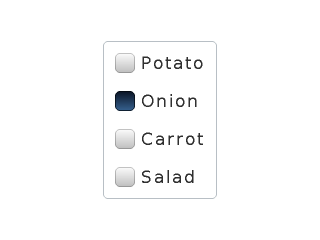
static lv_res_t cb_release_action(lv_obj_t * cb)
{
    /*A check box is clicked*/
    printf("%s state: %d\n", lv_cb_get_text(cb), lv_cb_is_checked(cb));

    return LV_RES_OK;
}

.
.
.


/********************************************
 * Create a container for the check boxes
 ********************************************/

/*Create  border style*/
static lv_style_t style_border;
lv_style_copy(&style_border, &lv_style_pretty_color);
style_border.glass = 1;
style_border.body.empty = 1;

/*Create a container*/
lv_obj_t * cont;
cont = lv_cont_create(lv_scr_act(), NULL);
lv_cont_set_layout(cont, LV_LAYOUT_COL_L);      /*Arrange the children in a column*/
lv_cont_set_fit(cont, true, true);              /*Fit the size to the content*/
lv_obj_set_style(cont, &style_border);

/**************************
 * Create check boxes
 *************************/

/*Create check box*/
lv_obj_t * cb;
cb = lv_cb_create(cont, NULL);
lv_cb_set_text(cb, "Potato");
lv_cb_set_action(cb, cb_release_action);

/*Copy the previous check box*/
cb = lv_cb_create(cont, cb);
lv_cb_set_text(cb, "Onion");

/*Copy the previous check box*/
cb = lv_cb_create(cont, cb);
lv_cb_set_text(cb, "Carrot");

/*Copy the previous check box*/
cb = lv_cb_create(cont, cb);
lv_cb_set_text(cb, "Salad");

/*Align the container to the middle*/
lv_obj_align(cont, NULL, LV_ALIGN_CENTER, 0, 0);
Container (lv_cont)
Written for v5.1
Overview
The containers are rectangle-like object with some special features.
You can apply a layout on the containers to automatically order their children. The layout spacing comes from style.body.padding.hor/ver/inner properties. The possible layout options:
- LV_LAYOUT_OFF: Do not align the children
- LV_LAYOUT_CENTER: Align children to the center in column and keep pad.inner space between them
- LV_LAYOUT_COL_L: Align children in a left justified column. Keep pad.hor space on the left, pad.ver space on the top and pad.inner space between the children.
- LV_LAYOUT_COL_M: Align children in centered column. Keep pad.ver space on the top and pad.inner space between the children.
- LV_LAYOUT_COL_R: Align children in a right justified column. Keep pad.hor space on the right, pad.ver space on the top and pad.inner space between the children.
- LV_LAYOUT_ROW_T: Align children in a top justified row. Keep pad.hor space on the left, pad.ver space on the top and pad.inner space between the children.
- LV_LAYOUT_ROW_M: Align children in centered row. Keep pad.hor space on the left and pad.inner space between the children.
- LV_LAYOUT_ROW_B: Align children in a bottom justified row. Keep pad.hor space on the left, pad.ver space on the bottom and pad.inner space between the children.
- LV_LAYOUT_PRETTY: Put as may objects as possible in a row (with at least pad.inner space and pad.hor space on the sides) and begin a new row. Divide the space in each line equally between the children. Keep pad.ver space on the top and pad.inner space between the lines.
- LV_LAYOUT_GRID: Similar to PRETTY LAYOUT but not divide horizontal space equally just let pad.hor space
You can enable an auto fit feature which automatically set the container size to include all children. It will keep pad.hor space on the left and right and pad.ver space on the top an bottom. The auto fit can be enable horizontally, vertically or in both direction with lv_cont_set_fit(cont, true, true) function. The second parameter is the horizontal, the third parameter is the vertical fit enable.
Style usage
- style.body properties are used.
Notes
- You can't set the child position with hor/ver fit enabled. Let's imagine what happens. If you change the position of the only child when fit is enabled the the container will move/fit "around" the new position. If you have more objects on a container then you can align them relative to each other. As a workaround you can create a small transparent object on the container. It will fix the container to not "follow" the children.
Example
lv_obj_t * box1;
box1 = lv_cont_create(lv_scr_act(), NULL);
lv_obj_set_style(box1, &lv_style_pretty);
lv_cont_set_fit(box1, true, true);

/*Add a text to the container*/
lv_obj_t * txt = lv_label_create(box1, NULL);
lv_label_set_text(txt, "Lorem ipsum dolor\n"
                       "sit amet, consectetur\n"
                       "adipiscing elit, sed do\n"
                       "eiusmod tempor incididunt\n"
                       "ut labore et dolore\n"
                       "magna aliqua.");

lv_obj_align(box1, NULL, LV_ALIGN_IN_TOP_LEFT, 10, 10);      /*Align the container*/

/*Create a style*/
static lv_style_t style;
lv_style_copy(&style, &lv_style_pretty_color);
style.body.shadow.width = 6;
style.body.padding.hor = 5;                                 /*Set a great horizontal padding*/

/*Create an other container*/
lv_obj_t * box2;
box2 = lv_cont_create(lv_scr_act(), NULL);
lv_obj_set_style(box2, &style);     /*Set the new style*/
lv_cont_set_fit(box2, true, false); /*Do not enable the vertical fit */
lv_obj_set_height(box2, 55);        /*Set a fix height*/

/*Add a text to the new container*/
lv_obj_t * txt2 = lv_label_create(box2, NULL);
lv_label_set_text(txt2, "No vertical fit 1...\n"
                        "No vertical fit 2...\n"
                        "No vertical fit 3...\n"
                        "No vertical fit 4...");

/*Align the container to the bottom of the previous*/
lv_obj_align(box2, box1, LV_ALIGN_OUT_BOTTOM_MID, 30, -30);
Drop down list (lv_ddlist)
Written for v5.3, revision 2
Overview
Drop Down Lists allow you to simply select one option from more. The Drop Down List is closed by default an show the currently selected text. If you click on it the this list opens and all the options are shown.
The options are passed to the Drop Down List as a string with lv_ddlist_set_options(ddlist, options). The options should be separated by \n. For example: "First\nSecond\nThird".
You can select an option manually with lv_ddlist_set_selected(ddlist, id), where _id_ is the index of an option.
A callback function can be specified with lv_ddlist_set_action(ddlist, my_action) to call when a new option is selected.
By default the list's height is adjusted automatically to show all options. The lv_ddlist_set_fix_height(ddlist, h) sets a fixed height for the opened list.
The width is also adjusted automatically. To prevent this apply lv_ddlist_set_hor_fit(ddlist, false) and set the width manually by lv_obj_set_width(ddlist, width).
Similarly to Page with fix height the Drop Down List supports various scrollbar display modes. It can be set by lv_ddlist_set_sb_mode(ddlist, LV_SB_MODE_...).
The Drop Down List open/close animation time is adjusted by lv_ddlist_set_anim_time(ddlist, anim_time). Zero animation time means no animation.
New in v5.3 is the ability to enable an arrow on the side of the drop down list. To use this feature you can call lv_ddlist_set_draw_arrow(ddlist, true).
Style usage
The lv_ddlist_set_style(ddlist, LV_DDLIST_STYLE_..., &style) set the styles of a Drop Down List.
- LV_DDLIST_STYLE_BG Style of the background. All style.body properties are used. It is used for the label's style from style.text. Default: _lv_style_pretty_
- LV_DDLIST_STYLE_SEL Style of the selected option. The style.body properties are used. The selected option will be recolored with text.color. Default: _lv_style_plain_color_
- LV_DDLIST_STYLE_SB Style of the scrollbar. The style.body properties are used. Default: _lv_style_plain_color_
Example
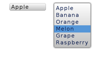
static lv_res_t ddlist_action(lv_obj_t * ddlist)
{
    uint8_t id = lv_obj_get_free_num(ddlist);

    char sel_str[32];
    lv_ddlist_get_selected_str(ddlist, sel_str);
    printf("Ddlist %d new option: %s \n", id, sel_str);

    return LV_RES_OK; /*Return OK if the drop down list is not deleted*/
}


.
.
.

/*Create a drop down list*/
lv_obj_t * ddl1 = lv_ddlist_create(lv_scr_act(), NULL);
lv_ddlist_set_options(ddl1, "Apple\n"
                            "Banana\n"
                            "Orange\n"
                            "Melon\n"
                            "Grape\n"
                            "Raspberry");
lv_obj_align(ddl1, NULL, LV_ALIGN_IN_TOP_LEFT, 30, 10);
lv_obj_set_free_num(ddl1, 1);               /*Set a unique ID*/
lv_ddlist_set_action(ddl1, ddlist_action);  /*Set a function to call when anew option is chosen*/

/*Create a style*/
static lv_style_t style_bg;
lv_style_copy(&style_bg, &lv_style_pretty);
style_bg.body.shadow.width = 4; /*Enable the shadow*/
style_bg.text.color = LV_COLOR_MAKE(0x10, 0x20, 0x50);

/*Copy the drop down list and set the new style_bg*/
lv_obj_t * ddl2 = lv_ddlist_create(lv_scr_act(), ddl1);
lv_obj_align(ddl2, NULL, LV_ALIGN_IN_TOP_RIGHT, -30, 10);
lv_obj_set_free_num(ddl2, 2);       /*Set a unique ID*/
lv_obj_set_style(ddl2, &style_bg);
Gauge (lv_gauge)
Written for v5.1
Overview
The gauge is a meter with scale labels and needles. You can use the lv_gauge_set_scale(gauge, angle, line_num, label_cnt) function to adjust the scale angle and the number of the scale lines and labels. The default settings are: 220 degrees, 6 scale labels and 21 lines.
The gauge can show more then one needles . Use the lv_gauge_set_needle_count(gauge, needle_num, color_array) function to set the number of needles and an array with colors for each needle. (The array must be static or global variable).
You can use lv_gauge_set_value(gauge, needle_id, value) to set the value of a needle.
To set a critical value use lv_gauge_set_critical_value(gauge, value). The scale color ill be changed to line.color after this value. (default: 80)
The range of the gauge can be specified by lv_gauge_set_range(gauge, min, max).
Style usage
The gauge uses one style which can be set by lv_gauge_set_style(gauge, &style). The gauge's properties are derived from the following style attributes:
- body.main_color line's color at the beginning of the scale
- body.grad_color line's color at the end of the scale (gradient with main color)
- body.padding.hor line length
- body.padding.inner label distance from the scale lines
- line.width line width
- line.color line's color after the critical value
- text.font/color/letter_space label attributes
Example
/*Create a style*/
static lv_style_t style;
lv_style_copy(&style, &lv_style_pretty_color);
style.body.main_color = LV_COLOR_HEX3(0x666);     /*Line color at the beginning*/
style.body.grad_color =  LV_COLOR_HEX3(0x666);    /*Line color at the end*/
style.body.padding.hor = 10;                      /*Scale line length*/
style.body.padding.inner = 8 ;                    /*Scale label padding*/
style.body.border.color = LV_COLOR_HEX3(0x333);   /*Needle middle circle color*/
style.line.width = 3;
style.text.color = LV_COLOR_HEX3(0x333);
style.line.color = LV_COLOR_RED;                  /*Line color after the critical value*/


/*Describe the color for the needles*/
static lv_color_t needle_colors[] = {LV_COLOR_BLUE, LV_COLOR_ORANGE, LV_COLOR_PURPLE};

/*Create a gauge*/
lv_obj_t * gauge1 = lv_gauge_create(lv_scr_act(), NULL);
lv_gauge_set_style(gauge1, &style);
lv_gauge_set_needle_count(gauge1, 3, needle_colors);
lv_obj_align(gauge1, NULL, LV_ALIGN_CENTER, 0, 20);

/*Set the values*/
lv_gauge_set_value(gauge1, 0, 10);
lv_gauge_set_value(gauge1, 1, 20);
lv_gauge_set_value(gauge1, 2, 30);
Image (lv_img)
Written for v5.1
Overview
The Images are the basic object to display images. To provide maximum flexibility the source of the image can be:
- a variable in the code (a C array with the pixels)
- a file stored externally (like on an SD card)
- a text with Symbols
To set the source of an image the lv_img_set_src function can be used.
To generate a pixel array from a PNG, JPG or BMP image use the Online image converter tool and set the converted image with its pointer:
lv_img_set_src(img1, &converted_img_var);
To use external files you also need to convert the image files using the online converter tool but now you should select the binary Output format. To see how to handle external image files from LittlevGL check the Tutorial.
You can set a symbol from lv_symbol_def.h too. In this case, the image will be rendered as text according to the font specified in the style. It enables to use light weighted mono-color "letters" instead of real images. You can set symbol like this:
lv_img_set_src(img1, SYMBOL_OK);
The internal (variable) and external images support 2 transparency handling methods:
- Chrome keying
LV_COLOR_TRANSP(lv_conf.h) will be transparent - Alpha byte Add an alpha byte to every pixel
These options can be selected in the online font converter.
The images can be re-colored in run-time to any color according to the brightness of the pixels. It is very useful to show different states (selected, inactive, pressed etc) of an image without storing more versions of the same image. This feature can be enabled in the style by setting img.intense between LV_OPA_TRANSP (no recolor, value: 0) and LV_OPA_COVER (full recolor, value: 255). The default value is LV_OPA_TRANSP so this feature is disabled.
It is possible to automatically set the size of the image object to the image source's width and height if enabled by the lv_img_set_auto_size(image, true) function. If auto size is enabled then when a new file is set the object size is automatically changed. Later you can modify the size manually. If the object size is
greater then the image size in any directions then the image will be repeated like a mosaic. The auto size is enabled by default if the image is not a screen.
The images' default style is NULL so they inherit the parent's style.
Style usage
- For images style.img
- For symbols style.text
Notes
- Symbols names (like SYMBOL_EDIT) are short strings, therefore, you can concatenate them to show more symbols.
Example

/*Declare a cogwheel image variable*/
LV_IMG_DECLARE(img_cw);

[...]

/***************************************
 * Create three images and re-color them
 ***************************************/

/*Create the first image without re-color*/
lv_obj_t * img1 = lv_img_create(lv_scr_act(), NULL);
lv_img_set_src(img1, &img_cw);
lv_obj_align(img1, NULL, LV_ALIGN_IN_TOP_LEFT, 20, 40);

/*Create style to re-color with light blue*/
static lv_style_t style_img2;
lv_style_copy( &style_img2, &lv_style_plain);
style_img2.image.color = LV_COLOR_HEX(0x003b75);
style_img2.image.intense = LV_OPA_50;

/*Create an image with the light blue style*/
lv_obj_t * img2 = lv_img_create(lv_scr_act(), img1);
lv_obj_set_style(img2, &style_img2);
lv_obj_align(img2, NULL, LV_ALIGN_IN_TOP_MID, 0, 40);

/*Create style to re-color with dark blue*/
static lv_style_t style_img3;
lv_style_copy(&style_img3, &lv_style_plain);
style_img3.image.color = LV_COLOR_HEX(0x003b75);
style_img3.image.intense = LV_OPA_90;

/*Create an image with the dark blue style*/
lv_obj_t * img3 = lv_img_create(lv_scr_act(), img2);
lv_obj_set_style(img3, &style_img3);
lv_obj_align(img3, NULL, LV_ALIGN_IN_TOP_RIGHT, -20, 40);


/**************************************
 * Create an image with symbols
 **************************************/

/*Create a string from symbols*/
char buf[32];
sprintf(buf, "%s%s%s%s%s%s%s",
             SYMBOL_DRIVE, SYMBOL_FILE, SYMBOL_DIRECTORY, SYMBOL_SETTINGS,
             SYMBOL_POWER, SYMBOL_GPS, SYMBOL_BLUETOOTH);

/*Create style with a symbol font*/
static lv_style_t style_sym;
lv_style_copy(&style_sym, &lv_style_plain);
// The built-in fonts are extended with symbols
style_sym.text.font = &lv_font_dejavu_60;
style_sym.text.letter_space = 10;

/*Create an image and use the string as source*/
lv_obj_t * img_sym = lv_img_create(lv_scr_act(), NULL);
lv_img_set_src(img_sym, buf);
lv_img_set_style(img_sym, &style_sym);
lv_obj_align(img_sym, NULL, LV_ALIGN_IN_BOTTOM_MID, 0, -30);


/*Create description labels*/
lv_obj_t * label = lv_label_create(lv_scr_act(), NULL);
lv_label_set_text(label, "Re-color the images in run time");
lv_obj_align(label, NULL, LV_ALIGN_IN_TOP_MID, 0, 15);

label = lv_label_create(lv_scr_act(), NULL);
lv_label_set_text(label, "Use symbols from fonts as images");
lv_obj_align(label, NULL, LV_ALIGN_IN_BOTTOM_MID, 0, -80);
Image button (lv_imgbtn)
Written for v5.2
Overview
The Image button is very similar to the simple Button object. The only difference is it displays user-defined images in each state instead of drawing a button. Before reading this please learn how the Buttons work in LittlevGL.
To set the image in a state the lv_imgbtn_set_src(imgbtn, LV_BTN_STATE_..., &img_src) The image sources works the same as described in the Image object.
Similarly to the Button object actions (callbacks) can be assigned by lv_imgbtn_set_action(imgbtn, LV_BTN_ACTION_..., my_action).
The states also work like with Button object. It can be set with lv_imgbtn_set_state(imgbtn, LV_BTN_STATE_...).
The toggle feature can be enabled with lv_imgbtn_set_toggle(imgbtn, true)
Style usage
The Image buttons can have unique styles for each state. All the style.image properties used by the Image button:
- image.color Recolor the image to this color according to
intense - image.intense The extent of recoloring (0..255 or
LV_OPA_0/10/20..100) - image.opa The opacity of the object (0..255 or
LV_OPA_0/10/20..100)
Notes
Example
/*Create style to make the button darker when pressed*/
lv_style_t style_pr;
lv_style_copy(&style_pr, &lv_style_plain);
style_pr.image.color = LV_COLOR_BLACK;
style_pr.image.intense = LV_OPA_50;
style_pr.text.color = LV_COLOR_HEX3(0xaaa);

LV_IMG_DECLARE(imgbtn_green);
LV_IMG_DECLARE(imgbtn_blue);

/*Create an Image button*/
lv_obj_t * imgbtn1 = lv_imgbtn_create(lv_scr_act(), NULL);
lv_imgbtn_set_src(imgbtn1, LV_BTN_STATE_REL, &imgbtn_green);
lv_imgbtn_set_src(imgbtn1, LV_BTN_STATE_PR, &imgbtn_green);
lv_imgbtn_set_src(imgbtn1, LV_BTN_STATE_TGL_REL, &imgbtn_blue);
lv_imgbtn_set_src(imgbtn1, LV_BTN_STATE_TGL_PR, &imgbtn_blue);
lv_imgbtn_set_style(imgbtn1, LV_BTN_STATE_PR, &style_pr);        /*Use the darker style in the pressed state*/
lv_imgbtn_set_style(imgbtn1, LV_BTN_STATE_TGL_PR, &style_pr);
lv_imgbtn_set_toggle(imgbtn1, true);
lv_obj_align(imgbtn1, NULL, LV_ALIGN_CENTER, 0, -40);

/*Create a label on the Image button*/
lv_obj_t * label = lv_label_create(imgbtn1, NULL);
lv_label_set_text(label, "Button");

/*Copy the fist image button and set Toggled state*/
lv_obj_t * imgbtn2 = lv_imgbtn_create(lv_scr_act(), imgbtn1);
lv_btn_set_state(imgbtn2, LV_BTN_STATE_TGL_REL);
lv_obj_align(imgbtn2, imgbtn1, LV_ALIGN_OUT_BOTTOM_MID, 0, 20);

/*Create a label on the Image button*/
label = lv_label_create(imgbtn2, NULL);
lv_label_set_text(label, "Button");
Keyboard (lv_kb)
Written for v5.1
Overview
As it names shows the Keyboard object provides a keyboard to write text. You can assign a Text area to the Keyboard to put the clicked characters there. To assign the Text area use lv_kb_set_ta(kb, ta).
The keyboard contains an _Ok_ and a Hide button. An ok and a hide action can be specified by lv_kb_set_ok_action(kb, action) and lv_kb_set_hide_action(kb, action) to add callbacks to Ok/Hide clicks. If no action is specified then the buttons will delete the Keyboard.
The assigned Text area's cursor can be managed by the keyboard: when the keyboard is assigned the previous Text area's cursor will be hidden an the new's will be shown. Clicking on _Ok_ or Hide will also hide the cursor. The cursor manager feature is enabled by lv_kb_set_cursor_manage(kb, true). The default is not manage.
The Keyboards have two modes:
- LV_KB_MODE_TEXT: display letters, number and special characters
- LV_KB_MODE_NUM: display numbers, +/- sign and dot
To set the mode use lv_kb_set_mode(kb, mode). The default is _LV_KB_MODE_TEXT_
You can specify a new map (layout) for the keyboard with lv_kb_set_map(kb, map). It works like a the Button matrix so control character can be added to the layout the set button width and other attributes. Keep in mind using following keywords will have the same effect as with the original map: _SYMBOL_OK_, _SYMBOL_CLOSE_, _SYMBOL_LEFT_, _SYMBOL_RIGHT_, ABC, abc, Enter, Del, _#1_, +/- .
Style usage
The Keyboard works with 6 styles: a background and 5 button styles for each states. You can set the styles with lv_kb_set_style(btn, LV_KB_STYLE_..., &style). The background and the buttons use the style.body properties. The labels use the style.text properties of the button styles.
- LV_KB_STYLE_BG Background style. Uses all style.body properties including padding Default: _lv_style_pretty_
- LV_KB_STYLE_BTN_REL style of the released buttons. Default: _lv_style_btn_rel_
- LV_KB_STYLE_BTN_PR style of the pressed buttons. Default: _lv_style_btn_pr_
- LV_KB_STYLE_BTN_TGL_REL style of the toggled released buttons. Default: _lv_style_btn_tgl_rel_
- LV_KB_STYLE_BTN_TGL_PR style of the toggled pressed buttons. Default: _lv_style_btn_tgl_pr_
- LV_KB_STYLE_BTN_INA style of the inactive buttons. Default: _lv_style_btn_ina_
Example
/*Create styles for the keyboard*/
static lv_style_t rel_style, pr_style;

lv_style_copy(&rel_style, &lv_style_btn_rel);
rel_style.body.radius = 0;

lv_style_copy(&pr_style, &lv_style_btn_pr);
pr_style.body.radius = 0;

/*Create a keyboard and apply the styles*/
lv_obj_t *kb = lv_kb_create(lv_scr_act(), NULL);
lv_kb_set_cursor_manage(kb, true);
lv_kb_set_style(kb, LV_KB_STYLE_BG, &lv_style_transp_tight);
lv_kb_set_style(kb, LV_KB_STYLE_BTN_REL, &rel_style);
lv_kb_set_style(kb, LV_KB_STYLE_BTN_PR, &pr_style);

/*Create a text area. The keyboard will write here*/
lv_obj_t *ta = lv_ta_create(lv_scr_act(), NULL);
lv_obj_align(ta, NULL, LV_ALIGN_IN_TOP_MID, 0, 10);
lv_ta_set_text(ta, "");

/*Assign the text area to the keyboard*/
lv_kb_set_ta(kb, ta);
List (lv_list)
Written for v5.1
Overview
The Lists are built from a background Page and Buttons on it. The Buttons contain an optional icon-like Image (which can be a symbol too) and a Label. When the list become long enough it can be scrolled. The width of the buttons is set to maximum according to the object width. The height of the buttons are adjusted automatically according to the content (content height + style.body.padding.ver).
You can add new list element with lv_list_add(list, "U:/img", "Text", rel_action) or with symbol icon lv_list_add(list, SYMBOL_EDIT, "Edit text"). If you do no want to add image use NULL as file name. The function returns with a pointer to the created button to allow further configurations.
You can use lv_list_get_btn_label(list_btn) and lv_list_get_btn_img(list_btn) to get the label and the image of a list button.
In the release action of a button you can get the the button's text with lv_list_get_btn_text(button). It helps to identify the released list element.
To delete a list element just use lv_obj_del() on the return value of lv_list_add().
You can navigate manually in the list with lv_list_up(list) and lv_list_down(list).
You can focus on a button directly using lv_list_focus(btn, anim_en).
The animation time of up/down/focus movements can be set via: lv_list_set_anim_time(list, anim_time). Zero animation time means not animations.
Style usage
The lv_list_set_style(list, LV_LIST_STYLE_..., &style) function sets the style of a list. For details explanation of _BG_, SCRL and _SB_ see Page
- LV_LIST_STYLE_BG list background style. Default: _lv_style_transp_fit_
- LV_LIST_STYLE_SCRL scrollable parts's style. Default:_ lv_style_pretty_
- LV_LIST_STYLE_SB scrollbars' style. Default: _lv_style_pretty_color_
- LV_LIST_STYLE_BTN_REL button released style. Default: _lv_style_btn_rel_
- LV_LIST_STYLE_BTN_PR button pressed style. Default: _lv_style_btn_pr_
- LV_LIST_STYLE_BTN_TGL_REL button toggled released style. Default: _lv_style_btn_tgl_rel_
- LV_LIST_STYLE_BTN_TGL_PR button toggled pressed style. Default: _lv_style_btn_tgl_pr_
- LV_LIST_STYLE_BTN_INA button inactive style. Default: _lv_style_btn_ina_
Notes
- You can set a transparent background for the list. In this case if you have only a few list buttons the the list will look shorter but become scrollable when more list elements are added.
- The button labels default long mode is
LV_LABEL_LONG_ROLL. You can modify it manually. Uselv_list_get_btn_label()to get buttons's label. - To modify the height of the buttons adjust the body.padding.ver field of the corresponding style (LV_LIST_STYLE_BTN_REL , LV_LIST_STYLE_BTN_PR etc.)
Example
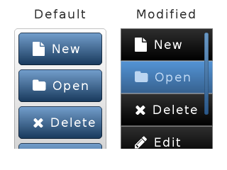
/*Will be called on click of a button of a list*/
static lv_res_t list_release_action(lv_obj_t * list_btn)
{
    printf("List element click:%s\n", lv_list_get_btn_text(list_btn));

    return LV_RES_OK; /*Return OK because the list is not deleted*/
}

.
.
.

/************************
 * Create a default list
 ************************/

/*Crate the list*/
lv_obj_t * list1 = lv_list_create(lv_scr_act(), NULL);
lv_obj_set_size(list1, 130, 170);
lv_obj_align(list1, NULL, LV_ALIGN_IN_TOP_LEFT, 20, 40);

/*Add list elements*/
lv_list_add(list1, SYMBOL_FILE, "New", list_release_action);
lv_list_add(list1, SYMBOL_DIRECTORY, "Open", list_release_action);
lv_list_add(list1, SYMBOL_CLOSE, "Delete", list_release_action);
lv_list_add(list1, SYMBOL_EDIT, "Edit", list_release_action);
lv_list_add(list1, SYMBOL_SAVE, "Save", list_release_action);

/*Create a label above the list*/
lv_obj_t * label;
label = lv_label_create(lv_scr_act(), NULL);
lv_label_set_text(label, "Default");
lv_obj_align(label, list1, LV_ALIGN_OUT_TOP_MID, 0, -10);

/*********************
 * Create new styles
 ********************/
/*Create a scroll bar style*/
static lv_style_t style_sb;
lv_style_copy(&style_sb, &lv_style_plain);
style_sb.body.main_color = LV_COLOR_BLACK;
style_sb.body.grad_color = LV_COLOR_BLACK;
style_sb.body.border.color = LV_COLOR_WHITE;
style_sb.body.border.width = 1;
style_sb.body.border.opa = LV_OPA_70;
style_sb.body.radius = LV_RADIUS_CIRCLE;
style_sb.body.opa = LV_OPA_60;

/*Create styles for the buttons*/
static lv_style_t style_btn_rel;
static lv_style_t style_btn_pr;
lv_style_copy(&style_btn_rel, &lv_style_btn_rel);
style_btn_rel.body.main_color = LV_COLOR_MAKE(0x30, 0x30, 0x30);
style_btn_rel.body.grad_color = LV_COLOR_BLACK;
style_btn_rel.body.border.color = LV_COLOR_SILVER;
style_btn_rel.body.border.width = 1;
style_btn_rel.body.border.opa = LV_OPA_50;
style_btn_rel.body.radius = 0;

lv_style_copy(&style_btn_pr, &style_btn_rel);
style_btn_pr.body.main_color = LV_COLOR_MAKE(0x55, 0x96, 0xd8);
style_btn_pr.body.grad_color = LV_COLOR_MAKE(0x37, 0x62, 0x90);
style_btn_pr.text.color = LV_COLOR_MAKE(0xbb, 0xd5, 0xf1);

/**************************************
 * Create a list with modified styles
 **************************************/

/*Copy the previous list*/
lv_obj_t * list2 = lv_list_create(lv_scr_act(),list1);
lv_obj_align(list2, NULL, LV_ALIGN_IN_TOP_RIGHT, -20, 40);
lv_list_set_sb_mode(list2, LV_SB_MODE_AUTO);
lv_list_set_style(list2, LV_LIST_STYLE_BG, &lv_style_transp_tight);
lv_list_set_style(list2, LV_LIST_STYLE_SCRL, &lv_style_transp_tight);
lv_list_set_style(list2, LV_LIST_STYLE_BTN_REL, &style_btn_rel); /*Set the new button styles*/
lv_list_set_style(list2, LV_LIST_STYLE_BTN_PR, &style_btn_pr);

/*Create a label above the list*/
label = lv_label_create(lv_scr_act(), label);       /*Copy the previous label*/
lv_label_set_text(label, "Modified");
lv_obj_align(label, list2, LV_ALIGN_OUT_TOP_MID, 0, -10);
LED (lv_led)
Written for v5.1
Overview
The LEDs are rectangle-like (or circle) object. You can set their brightness with lv_led_set_bright(led, bright). The brightness should be between 0 (darkest) and 255 (lightest).
Use lv_led_on(led) and lv_led_off(led) to set the brightness to a predefined ON or OFF value. The lv_led_toggle(led) toggles between the ON and OFF state.
Style usage
The LED uses one style which can be set by lv_led_set_style(led, &style). To determine the appearance the style.body properties are used. The colors are darkened and shadow width is reduced at a lower brightness and gains its original value at brightness 255 to show a lighting effect. The default style is: lv_style_pretty_color.
Notes
- Typically the default style is not suitable therefore you have to create you own style. See the Examples.
Example
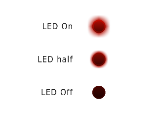
/*Create a style for the LED*/
static lv_style_t style_led;
lv_style_copy(&style_led, &lv_style_pretty_color);
style_led.body.radius = LV_RADIUS_CIRCLE;
style_led.body.main_color = LV_COLOR_MAKE(0xb5, 0x0f, 0x04);
style_led.body.grad_color = LV_COLOR_MAKE(0x50, 0x07, 0x02);
style_led.body.border.color = LV_COLOR_MAKE(0xfa, 0x0f, 0x00);
style_led.body.border.width = 3;
style_led.body.border.opa = LV_OPA_30;
style_led.body.shadow.color = LV_COLOR_MAKE(0xb5, 0x0f, 0x04);
style_led.body.shadow.width = 10;


/*Create a LED and switch it ON*/
lv_obj_t * led1  = lv_led_create(lv_scr_act(), NULL);
lv_obj_set_style(led1, &style_led);
lv_obj_align(led1, NULL, LV_ALIGN_IN_TOP_MID, 40, 40);
lv_led_on(led1);

/*Copy the previous LED and set a brightness*/
lv_obj_t * led2  = lv_led_create(lv_scr_act(), led1);
lv_obj_align(led2, led1, LV_ALIGN_OUT_BOTTOM_MID, 0, 40);
lv_led_set_bright(led2, 190);

/*Copy the previous LED and switch it OFF*/
lv_obj_t * led3  = lv_led_create(lv_scr_act(), led1);
lv_obj_align(led3, led2, LV_ALIGN_OUT_BOTTOM_MID, 0, 40);
lv_led_off(led3);

/*Create 3 labels next to the LEDs*/
lv_obj_t * label = lv_label_create(lv_scr_act(), NULL);
lv_label_set_text(label, "LED On");
lv_obj_align(label, led1, LV_ALIGN_OUT_LEFT_MID, -40, 0);

label = lv_label_create(lv_scr_act(), NULL);
lv_label_set_text(label, "LED half");
lv_obj_align(label, led2, LV_ALIGN_OUT_LEFT_MID, -40, 0);

label = lv_label_create(lv_scr_act(), NULL);
lv_label_set_text(label, "LED Off");
lv_obj_align(label, led3, LV_ALIGN_OUT_LEFT_MID, -40, 0);
Line (lv_line)
Written for v5.1
Overview
The line object is capable of drawing straight lines between a set of points. The points has to be stored in an lv_point_t array and passed to the object by the lv_line_set_points(lines, point_array, point_num) function.
It is possible to automatically set the size of the line object according to its points. You can enable it with the lv_line_set_auto_size(line, true) function. If enabled then when the points are set then the object width and height will be changed according to the max. x and max. y coordinates among the points. The auto size is enabled by default.
Basically the y == 0 point is in the top of the object but you can invert the y coordinates with lv_line_set_y_invert(line, true). After it the y coordinates will be subtracted from object's height.
Style usage
- style.line properties are used
Notes
Example
/*Create an array for the points of the line*/
static lv_point_t line_points[] = { {5, 5}, {70, 70}, {120, 10}, {180, 60}, {240, 10} };

/*Create line with default style*/
lv_obj_t * line1;
line1 = lv_line_create(lv_scr_act(), NULL);
lv_line_set_points(line1, line_points, 5);     /*Set the points*/
lv_obj_align(line1, NULL, LV_ALIGN_IN_TOP_MID, 0, 20);

/*Create new style (thin light blue)*/
static lv_style_t style_line2;
lv_style_copy(&style_line2, &lv_style_plain);
style_line2.line.color = LV_COLOR_MAKE(0x2e, 0x96, 0xff);
style_line2.line.width = 2;

/*Copy the previous line and apply the new style*/
lv_obj_t * line2 = lv_line_create(lv_scr_act(), line1);
lv_line_set_style(line2, &style_line2);
lv_obj_align(line2, line1, LV_ALIGN_OUT_BOTTOM_MID, 0, -20);

/*Create new style (thick dark blue)*/
static lv_style_t style_line3;
lv_style_copy(&style_line3, &lv_style_plain);
style_line3.line.color = LV_COLOR_MAKE(0x00, 0x3b, 0x75);
style_line3.line.width = 5;

/*Copy the previous line and apply the new style*/
lv_obj_t * line3 = lv_line_create(lv_scr_act(), line1);
lv_line_set_style(line3, &style_line3);
lv_obj_align(line3, line2, LV_ALIGN_OUT_BOTTOM_MID, 0, -20);
Line meter (lv_lmeter)
Written for v5.1
Overview
The Line Meter object consists of some radial lines which draw a scale. When setting a new value with lv_lmeter_set_value(lmeter, new_value) the proportional part of the scale will be recolored.
The lv_lmeter_set_range(lmeter, min, max) function sets the range of the line meter.
You can set the angle of the scale and the number of the lines by: lv_lmeter_set_scale(lmeter, angle, line_num). The default angle is 240 and the default line number is 31
Style usage
The line meter uses one style which can be set by lv_lmeter_set_style(lmeter, &style). The line meter's properties are derived from the following style attributes:
- line.color "inactive line's" color which are greater then the current value
- body.main_color "active line's" color at the beginning of the scale
- body.grad_color "active line's" color at the end of the scale (gradient with main color)
- body.padding.hor line length
- line.width line width
The default style is _lv_style_pretty_color_.
Notes
- The line meter has no background.
- It is recommended to use antialiasing on smaller dpi displays to show smooth lines
- Odd number of scale lines look better
- It looks better if the scale angle is: (line number - 1) * N, where N is an integer
Example
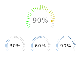
/*******************************
 * Create 3 similar line meter
 *******************************/

/*Create a simple style with ticker line width*/
static lv_style_t style_lmeter1;
lv_style_copy(&style_lmeter1, &lv_style_pretty_color);
style_lmeter1.line.width = 2;
style_lmeter1.line.color = LV_COLOR_SILVER;
style_lmeter1.body.main_color = LV_COLOR_HEX(0x91bfed);         /*Light blue*/
style_lmeter1.body.grad_color = LV_COLOR_HEX(0x04386c);         /*Dark blue*/

/*Create the first line meter */
lv_obj_t * lmeter;
lmeter = lv_lmeter_create(lv_scr_act(), NULL);
lv_lmeter_set_range(lmeter, 0, 100);                   /*Set the range*/
lv_lmeter_set_value(lmeter, 30);                       /*Set the current value*/
lv_lmeter_set_style(lmeter, &style_lmeter1);           /*Apply the new style*/
lv_obj_set_size(lmeter, 80, 80);
lv_obj_align(lmeter, NULL, LV_ALIGN_IN_BOTTOM_LEFT, 20, -20);

/*Add a label to show the current value*/
lv_obj_t * label;
label = lv_label_create(lmeter, NULL);
lv_label_set_text(label, "30%");
lv_label_set_style(label, &lv_style_pretty);
lv_obj_align(label, NULL, LV_ALIGN_CENTER, 0, 0);

/*Create the second line meter and label*/
lmeter = lv_lmeter_create(lv_scr_act(), lmeter);
lv_lmeter_set_value(lmeter, 60);
lv_obj_align(lmeter, NULL, LV_ALIGN_IN_BOTTOM_MID, 0, -20);

label = lv_label_create(lmeter, label);
lv_label_set_text(label, "60%");
lv_obj_align(label, NULL, LV_ALIGN_CENTER, 0, 0);

/*Create the third line meter and label*/
lmeter = lv_lmeter_create(lv_scr_act(), lmeter);
lv_lmeter_set_value(lmeter, 90);
lv_obj_align(lmeter, NULL, LV_ALIGN_IN_BOTTOM_RIGHT, -20, -20);

label = lv_label_create(lmeter, label);
lv_label_set_text(label, "90%");
lv_obj_align(label, NULL, LV_ALIGN_CENTER, 0, 0);

/*********************************
 * Create a greater line meter
 *********************************/

/*Create a new style*/
static lv_style_t style_lmeter2;
lv_style_copy(&style_lmeter2, &lv_style_pretty_color);
style_lmeter2.line.width = 2;
style_lmeter2.line.color = LV_COLOR_SILVER;
style_lmeter2.body.padding.hor = 16;            /*Line length*/
style_lmeter2.body.main_color = LV_COLOR_LIME;
style_lmeter2.body.grad_color = LV_COLOR_ORANGE;

/*Create the line meter*/
lmeter = lv_lmeter_create(lv_scr_act(), lmeter);
lv_obj_set_style(lmeter, &style_lmeter2);
lv_obj_set_size(lmeter, 120, 120);
lv_obj_align(lmeter, NULL, LV_ALIGN_IN_TOP_MID, 0, 20);
lv_lmeter_set_scale(lmeter, 240, 31);
lv_lmeter_set_value(lmeter, 90);

/*Create a label style with greater font*/
static lv_style_t style_label;
lv_style_copy(&style_label, &lv_style_pretty);
style_label.text.font = &lv_font_dejavu_60;
style_label.text.color = LV_COLOR_GRAY;

/*Add a label to show the current value*/
label = lv_label_create(lmeter, label);
lv_label_set_text(label, "90%");
lv_obj_set_style(label, &style_label);
lv_obj_align(label, NULL, LV_ALIGN_CENTER, 0, 0);
Label (lv_label)
Written for v5.1
Overview
The Labels are the basic objects to display text. There is no limitation in the text size because it's stored dynamically. You can modify the text in runtime at any time with lv_label_set_text().
You can use \n to make line break. For example: "line1\nline2\n\nline4"
The size of the label object can be automatically expanded to the text size or the text can be manipulated according to several long mode policies:
- LV_LABEL_LONG_EXPAND: Expand the object size to the text size (Default)
- LV_LABEL_LONG_BREAK: Keep the object width, break (wrap) the too long lines and expand the object height
- LV_LABEL_LONG_DOTS: Keep the object size, break the text and write dots in the last line
- LV_LABEL_LONG_SCROLL: Expand the object size and scroll the text on the parent (move the label object)
- LV_LABEL_LONG_ROLL: Keep the size and roll just the text (not the object)
You can specify the long mode with: lv_label_set_long_mode(label, long_mode)
It's important to note that if you change the LONG_MODE the size of the label obejct is already expanded to the text's size.
So you need to set the label's size with lv_obj_set_size() or lv_obj_set_width() after changing long mode.
Labels are able to show text from a static array. Use: lv_label_set_static_text(label, char_array). In this case, the text is not stored in the dynamic memory but the given array is used instead. Keep in my the array can't be a local variable which destroys when the function exits.
You can also use a raw character array as label text. The array doesn't have to be \0 terminated. In this case, the text will be saved to the dynamic memory. To set a raw character array use the lv_label_set_array_text(label, char_array) function.
The label's text can be aligned to the left, right or middle with lv_label_set_align(label, LV_LABEL_ALIGN_LEFT/RIGHT/CENTER)
You can enable to draw a background for the label with lv_label_set_body_draw(label, draw)
In the text, you can use commands to re-color parts of the text. For example: "Write a #ff0000 red# word". This feature can be enabled individually for each label by lv_label_set_recolor() function.
The labels can display symbols besides letters. Learn more about symbols here.
The labels' default style is NULL so they inherit the parent's style.
Style usage
- Use all properties from
style.text - For background drawing
style.body propertiesare used
Notes
The label's click enable attribute is disabled by default. You can enable clicking with lv_obj_set_click(label, true)
Example
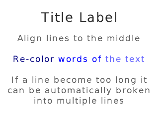
/*Create label on the screen. By default it will inherit the style of the screen*/
lv_obj_t * title = lv_label_create(lv_scr_act(), NULL);
lv_label_set_text(title, "Title Label");
lv_obj_align(title, NULL, LV_ALIGN_IN_TOP_MID, 0, 20);  /*Align to the top*/

/*Create anew style*/
static lv_style_t style_txt;
lv_style_copy(&style_txt, &lv_style_plain);
style_txt.text.font = &lv_font_dejavu_40;
style_txt.text.letter_space = 2;
style_txt.text.line_space = 1;
style_txt.text.color = LV_COLOR_HEX(0x606060);

/*Create a new label*/
lv_obj_t * txt = lv_label_create(lv_scr_act(), NULL);
lv_obj_set_style(txt, &style_txt);                    /*Set the created style*/
lv_label_set_long_mode(txt, LV_LABEL_LONG_BREAK);     /*Break the long lines*/
lv_label_set_recolor(txt, true);                      /*Enable re-coloring by commands in the text*/
lv_label_set_align(txt, LV_LABEL_ALIGN_CENTER);       /*Center aligned lines*/
lv_label_set_text(txt, "Align lines to the middle\n\n"
                       "#000080 Re-color# #0000ff words of# #6666ff the text#\n\n"
                       "If a line become too long it can be automatically broken into multiple lines");
lv_obj_set_width(txt, 300);                           /*Set a width*/
lv_obj_align(txt, NULL, LV_ALIGN_CENTER, 0, 20);      /*Align to center*/
Message box (lv_mbox)
Written for v5.1
Overview
The message boxes act as pop-ups. They are built from a background, a text and buttons. The background is a Container object with enabled vertical fit to ensure that the text and the buttons are always visible.
To set the text use the lv_mbox_set_text(mbox, "My text") function.
The buttons are a Button matrix. To add buttons use the lv_mbox_add_btns(mbox, btn_str, action) function. In this you can specify the button text e.g (const char * btn_str[] = {"btn1", "btn2", ""}) and add a callback which is called when a button is released. For more information visit the Button matrix's documentation.
With lv_mbox_start_auto_close(mbox, delay) the message box can be closed automatically after delay milliseconds with a long animation. The lv_mbox_stop_auto_close(mbox) function will stop a started auto close .
The close animation time can be adjusted by lv_mbox_set_anim_time(mbox, anim_time).
Style usage
Use lv_mbox_set_style(mbox, LV_MBOX_STYLE_..., &style) to set a new style for an element of the message box:
- LV_MBOX_STYLE_BG specifies the background container's style. style.body for background and style.label for the text appearance. Default: lv_style_pretty
- LV_MBOX_STYLE_BTN_BG style of the buttons (button matrix) background. Default: lv_style_transp
- LV_MBOX_STYLE_BTN_REL style of the released buttons. Default: lv_style_btn_rel
- LV_MBOX_STYLE_BTN_PR style of the pressed buttons. Default: lv_style_btn_pr
- LV_MBOX_STYLE_BTN_TGL_REL style of the toggled released buttons. Default: lv_style_btn_tgl_rel
- LV_MBOX_STYLE_BTN_TGL_PR style of the toggled pressed buttons. Default: lv_style_btn_tgl_pr
- LV_MBOX_STYLE_BTN_INA style of the inactive buttons. Default: lv_style_btn_ina
Notes
- The height of the buttons comes from the font height + 2 × body.vpad of _LV_MBOX_STYLE_BTN_REL_
Example
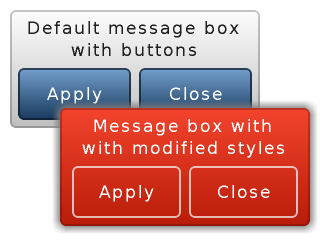
/*Called when a button is clicked*/
static lv_res_t mbox_apply_action(lv_obj_t * mbox, const char * txt)
{
    printf("Mbox button: %s\n", txt);

    return LV_RES_OK; /*Return OK if the message box is not deleted*/
}

.
.
.
.

/*******************************
 * Create a default message box
 *******************************/

lv_obj_t * mbox1 = lv_mbox_create(lv_scr_act(), NULL);
lv_mbox_set_text(mbox1, "Default message box\n"
                        "with buttons");                    /*Set the text*/
/*Add two buttons*/
static const char * btns[] ={"\221Apply", "\221Close", ""}; /*Button description. '\221' lv_btnm like control char*/
lv_mbox_add_btns(mbox1, btns, NULL);
lv_obj_set_width(mbox1, 250);
lv_obj_align(mbox1, NULL, LV_ALIGN_IN_TOP_LEFT, 10, 10); /*Align to the corner*/

/****************************************
 * Create a message box with new styles
 ***************************************/

/*Create a new background style*/
static lv_style_t style_bg;
lv_style_copy(&style_bg, &lv_style_pretty);
style_bg.body.main_color = LV_COLOR_MAKE(0xf5, 0x45, 0x2e);
style_bg.body.grad_color = LV_COLOR_MAKE(0xb9, 0x1d, 0x09);
style_bg.body.border.color = LV_COLOR_MAKE(0x3f, 0x0a, 0x03);
style_bg.text.color = LV_COLOR_WHITE;
style_bg.body.padding.hor = 12;
style_bg.body.padding.ver = 8;
style_bg.body.shadow.width = 8;

/*Create released and pressed button styles*/
static lv_style_t style_btn_rel;
static lv_style_t style_btn_pr;
lv_style_copy(&style_btn_rel, &lv_style_btn_rel);
style_btn_rel.body.empty = 1;                    /*Draw only the border*/
style_btn_rel.body.border.color = LV_COLOR_WHITE;
style_btn_rel.body.border.width = 2;
style_btn_rel.body.border.opa = LV_OPA_70;
style_btn_rel.body.padding.hor = 12;
style_btn_rel.body.padding.ver = 8;

lv_style_copy(&style_btn_pr, &style_btn_rel);
style_btn_pr.body.empty = 0;
style_btn_pr.body.main_color = LV_COLOR_MAKE(0x5d, 0x0f, 0x04);
style_btn_pr.body.grad_color = LV_COLOR_MAKE(0x5d, 0x0f, 0x04);

/*Copy the message box (The buttons will be copied too)*/
lv_obj_t * mbox2 = lv_mbox_create(lv_scr_act(), mbox1);
lv_mbox_set_text(mbox2, "Message box with\n"
                        "with modified styles");
lv_mbox_set_style(mbox2, LV_MBOX_STYLE_BG, &style_bg);
lv_mbox_set_style(mbox2, LV_MBOX_STYLE_BTN_REL, &style_btn_rel);
lv_mbox_set_style(mbox2, LV_MBOX_STYLE_BTN_PR, &style_btn_pr);
lv_obj_align(mbox2, mbox1, LV_ALIGN_OUT_BOTTOM_LEFT, 50, -20);   /*Align according to the previous message box */
Page (lv_page)
Written for v5.1
Overview
The Page consist of two containers on each other: the bottom is the background (or base) and the top is the scrollable. If you create a child on the page it will be automatically moved to the scrollable container. If the scrollable container become greater then the background it can be scrolled by dragging (like the lists on smart phones).
By default the scrollable's auto fit attribute is enabled vertically so its height will increased to include all its children. The width of the scrollable is automatically adjusted to the background width (minus the background's horizontal padding).
The background object can be referenced as the page itself like: lv_obj_set_width(page, 100).
The scrollbar object can be retrieved with: lv_page_get_scrl(page).
Scrollbars can be shown according to four policies:
- LV_SB_MODE_OFF: Never show scrollbars
- LV_SB_MODE_ON: Always show scrollbars
- LV_SB_MODE_DRAG: Show scrollbars when page is being dragged
- LV_SB_MODE_AUTO: Show scrollbars when the scrollable container is large enough to be scrolled
You can set scroll bar show policy by: lv_page_set_sb_mode(page, SB_MODE). The default value is _LV_PAGE_SB_MODE_ON_;
You can glue a children to the page. In this case you can scroll the page with dragging the child object. It can be enabled by the lv_page_glue_obj(child, true).
You can focus to an object on a page with: lv_page_focus(page, child, anim_time).
It will moves the scrollable container to show a child. If the last parameter is not zero then the page will move with an animation.
A release and a press action can be assigned to the Page with lv_page_set_rel_action(page, my_rel_action) and lv_page_set_pr_action(page, my_pr_action). The action can be triggered from the Background and the Scrollable object too.
There are functions to directly set/get the scrollable's attributes:
lv_page_set_scrl_fit()lv_page_set_scrl_width()lv_page_set_scrl_height()lv_page_set_scrl_layout()
Style usage
Use lv_page_set_style(page, LV_PAGE_STYLE_..., &style) to set a new style for an element of the page:
- LV_PAGE_STYLE_BG background's style which uses all style.body properties (default: lv_style_pretty_color)
- LV_PAGE_STYLE_SCRL scrollable's style which uses all style.body properties (default: lv_style_pretty)
- LV_PAGE_STYLE_SB scroll bar's style which uses all style.body properties. hor/ver* padding sets the scrollbars' padding respectively and the inner padding sets the scrollbar's width. (default: lv_style_pretty_color)
Notes
- Setting the position of children is not possible in x or y direction if the corresponding hor or ver fit is enabled. It's because if the _y_ coordinate is modified (with ver fit enabled) the scrollable object will resized to be directly above and below the child. But a scrollable part can't be in the middle so it will be moved back to the top. To avoid this use
lv_obj_align()to place object relative to each other (one has to be in to top/left) or disable fit withlv_page_set_scrl_fit(page, false, false);and set it's sizelv_page_set_scrl_width/height(page, 100). - The background draws its border when the scrollable is drawn. It ensures that the page always will have closed shape even if the scrollable has the same color as the page's parent.
Example
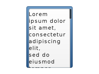
/*Create a scroll bar style*/
static lv_style_t style_sb;
lv_style_copy(&style_sb, &lv_style_plain);
style_sb.body.main_color = LV_COLOR_BLACK;
style_sb.body.grad_color = LV_COLOR_BLACK;
style_sb.body.border.color = LV_COLOR_WHITE;
style_sb.body.border.width = 1;
style_sb.body.border.opa = LV_OPA_70;
style_sb.body.radius = LV_RADIUS_CIRCLE;
style_sb.body.opa = LV_OPA_60;
style_sb.body.padding.hor = 3;          /*Horizontal padding on the right*/
style_sb.body.padding.inner = 8;        /*Scrollbar width*/

/*Create a page*/
lv_obj_t * page = lv_page_create(lv_scr_act(), NULL);
lv_obj_set_size(page, 150, 200);
lv_obj_align(page, NULL, LV_ALIGN_CENTER, 0, 0);
lv_page_set_style(page, LV_PAGE_STYLE_SB, &style_sb);           /*Set the scrollbar style*/
lv_page_set_sb_mode(page, LV_SB_MODE_AUTO);                     /*Show scroll bars is scrolling is possible*/

/*Create a label on the page*/
lv_obj_t * label = lv_label_create(page, NULL);
lv_label_set_long_mode(label, LV_LABEL_LONG_BREAK);             /*Automatically break long lines*/
lv_obj_set_width(label, lv_page_get_scrl_width(page));          /*Set the width. Lines will break here*/
lv_label_set_text(label, "Lorem ipsum dolor sit amet, consectetur adipiscing elit,\n"
                         "sed do eiusmod tempor incididunt ut labore et dolore magna aliqua.\n"
                         "Ut enim ad minim veniam, quis nostrud exercitation ullamco\n"
                         "laboris nisi ut aliquip ex ea commodo consequat. Duis aute irure\n"
                         "dolor in reprehenderit in voluptate velit esse cillum dolore\n"
                         "eu fugiat nulla pariatur.\n"
                         "Excepteur sint occaecat cupidatat non proident, sunt in culpa\n"
                         "qui officia deserunt mollit anim id est laborum.");
Preloader (lv_preload)
Written for v5.2
Overview
The preloader object is a spinning arc over a border.
The length of the arc can be adjusted by lv_preload_set_arc_length(preload, deg).
The speed of the spinning can be adjusted by lv_preload_set_spin_time(preload, time_ms).
Style usage
The LV_PRELOAD_STYLE_MAIN style describes both the arc and the border style:
- arc is described by the
lineproperties - border is described by the
body.borderproperties includingbody.padding.hor/ver(smaller is used) to give a smaller radius for the border.
Example

/*Create a style for the Preloader*/
static lv_style_t style;
lv_style_copy(&style, &lv_style_plain);
style.line.width = 10;                         /*10 px thick arc*/
style.line.color = LV_COLOR_HEX3(0x258);       /*Blueish arc color*/

style.body.border.color = LV_COLOR_HEX3(0xBBB); /*Gray background color*/
style.body.border.width = 10;
style.body.padding.hor = 0;

/*Create a Preloader object*/
lv_obj_t * preload = lv_preload_create(lv_scr_act(), NULL);
lv_obj_set_size(preload, 100, 100);
lv_obj_align(preload, NULL, LV_ALIGN_CENTER, 0, 0);
lv_preload_set_style(preload, LV_PRELOAD_STYLE_MAIN, &style);
Roller (lv_roller)
Written for v5.1 Updated to v5.2
Overview
Roller allow you to simply select one option from more with scrolling. Its functionalities are similar to Drop down list.
The options are passed to the Roller as a string with lv_roller_set_options(roller, options). The options should be separated by \n. For example: "First\nSecond\nThird".
You can select an option manually with lv_roller_set_selected(roller, id), where _id_ is the index of an option.
A callback function can be specified with lv_roller_set_action(roller, my_action) to call when a new option is selected.
The roller's height can be adjusted with lv_roller_set_visible_row_count(roller, row_cnt) to set number of visible options.
The width is adjusted automatically. To prevent this apply lv_roller_set_hor_fit(roller, false) and set the width manually by lv_obj_set_width(roller, width). You should use lv_roller_set_hor_fit(roller, false) instead of lv_cont_set_fit(lv_page_get_scrl(roller), false, false);, ohterwise you'll get an LV_LABEL_ALIGN_LEFT style of the list label text.
The Roller's open/close animation time is adjusted by lv_roller_set_anim_time(roller, anim_time). Zero animation time means no animation. This feature is implemented within lv_ddlist.c in v5.2: lv_ddlist_set_anim_time(roller, anim_time); should be used for animation.
Style usage
The lv_roller_set_style(roller, LV_ROLLER_STYLE_..., &style) set the styles of a roller.
- LV_ROLLER_STYLE_BG Style of the background. All style.body properties are used. It is used for the label's style from style.text. Gradient is applied on the top and bottom as well. Default: _lv_style_pretty_
- LV_ROLLER_STYLE_SEL Style of the selected option. The style.body properties are used. The selected option will be recolored with text.color. Default: _lv_style_plain_color_
Example
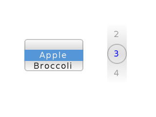
/*Create a default roller*/
lv_obj_t *roller1 = lv_roller_create(lv_scr_act(), NULL);
lv_roller_set_options(roller1, "Apple\n"
                               "Broccoli\n"
                               "Cabbage\n"
                               "Dewberry\n"
                               "Eggplant\n"
                               "Fig\n"
                               "Grapefruit");
lv_obj_set_pos(roller1, 50, 80);


/*Create styles*/
static lv_style_t bg_style;
lv_style_copy(&bg_style, &lv_style_pretty);
bg_style.body.main_color = LV_COLOR_WHITE;
bg_style.body.grad_color = LV_COLOR_HEX3(0xddd);
bg_style.body.border.width = 0;
bg_style.text.line_space = 20;
bg_style.text.opa = LV_OPA_40;

static lv_style_t sel_style;
lv_style_copy(&sel_style, &lv_style_pretty);
sel_style.body.empty = 1;
sel_style.body.radius = LV_RADIUS_CIRCLE;
sel_style.text.color = LV_COLOR_BLUE;

/*Create a roller and apply the new styles*/
lv_obj_t *roller2 = lv_roller_create(lv_scr_act(), NULL);
lv_roller_set_options(roller2, "0\n"
                               "1\n"
                               "2\n"
                               "3\n"
                               "4\n"
                               "5\n"
                               "6\n"
                               "7\n"
                               "8\n"
                               "9");
lv_roller_set_style(roller2, LV_ROLLER_STYLE_BG, &bg_style);
lv_roller_set_selected(roller2, 3, false);
lv_roller_set_style(roller2, LV_ROLLER_STYLE_SEL, &sel_style);
lv_roller_set_visible_row_count(roller2, 3);
lv_roller_set_hor_fit(roller2, false);
lv_obj_set_width(roller2, 40);
lv_obj_set_pos(roller2, 220, 50);
Slider (lv_slider)
Written for v6.0
Overview
The Slider object looks like a Bar supplemented with a Knob. The Knob can be dragged to set a value. The Slider also can be vertical or horizontal.
To set an initial value use lv_slider_set_value(slider, new_value) function or lv_slider_set_value_anim(slider, new_value, anim_time) to set the value with an animation.
To specify the range (min, max values) the lv_slider_set_range(slider, min , max) can be used.
A callback function can be assigned to call when a new value is set by the user: lv_slider_set_action(slider, my_action).
The knob can be placed two ways:
- inside the background on min/max values
- on the edges on min/max values
Use the lv_slider_set_knob_in(slider, true/false) to choose between the modes. (knob_in == false is the default)
Styles
You can modify the slider's styles with lv_slider_set_style(slider, LV_SLIDER_STYLE_..., &style).
- LV_SLIDER_STYLE_BG Style of the background. All style.body properties are used. The padding values make the slider smaller then the knob. (negative value makes is larger)
- LV_SLIDER_STYLE_INDIC Style of the indicator. All style.body properties are used. The padding values make the indicator smaller then the background.
- LV_SLIDER_STYLE_KNOB Style of the knob. The style.body properties are used except padding
Events
- LV_EVENT_VALUE_CHANGED Sent while slider is being dragged or changed with keys
Keys
- LV_KEY_UP, LV_KEY_RIGHT Increment the slider's value by 1
- LV_KEY_DOWN, LV_KEY_LEFT Decrement the slider's value by 1
Example
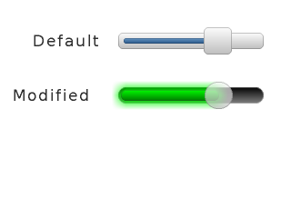
/*Called when a new value id set on the slider*/
static lv_res_t slider_action(lv_obj_t * slider)
{
    printf("New slider value: %d\n", lv_slider_get_value(slider));

    return LV_RES_OK;
}

.
.
.

/*Create a default slider*/
lv_obj_t * slider1 = lv_slider_create(lv_scr_act(), NULL);
lv_obj_set_size(slider1, 160, 30);
lv_obj_align(slider1, NULL, LV_ALIGN_IN_TOP_RIGHT, -30, 30);
lv_slider_set_action(slider1, slider_action);
lv_bar_set_value(slider1, 70);


/*Create a label right to the slider*/
lv_obj_t * slider1_label = lv_label_create(lv_scr_act(), NULL);
lv_label_set_text(slider1_label, "Default");
lv_obj_align(slider1_label, slider1, LV_ALIGN_OUT_LEFT_MID, -20, 0);

/*Create a bar, an indicator and a knob style*/
static lv_style_t style_bg;
static lv_style_t style_indic;
static lv_style_t style_knob;

lv_style_copy(&style_bg, &lv_style_pretty);
style_bg.body.main_color =  LV_COLOR_BLACK;
style_bg.body.grad_color =  LV_COLOR_GRAY;
style_bg.body.radius = LV_RADIUS_CIRCLE;
style_bg.body.border.color = LV_COLOR_WHITE;

lv_style_copy(&style_indic, &lv_style_pretty);
style_indic.body.grad_color =  LV_COLOR_GREEN;
style_indic.body.main_color =  LV_COLOR_LIME;
style_indic.body.radius = LV_RADIUS_CIRCLE;
style_indic.body.shadow.width = 10;
style_indic.body.shadow.color = LV_COLOR_LIME;
style_indic.body.padding.hor = 3;
style_indic.body.padding.ver = 3;

lv_style_copy(&style_knob, &lv_style_pretty);
style_knob.body.radius = LV_RADIUS_CIRCLE;
style_knob.body.opa = LV_OPA_70;
style_knob.body.padding.ver = 10 ;

/*Create a second slider*/
lv_obj_t * slider2 = lv_slider_create(lv_scr_act(), slider1);
lv_slider_set_style(slider2, LV_SLIDER_STYLE_BG, &style_bg);
lv_slider_set_style(slider2, LV_SLIDER_STYLE_INDIC,&style_indic);
lv_slider_set_style(slider2, LV_SLIDER_STYLE_KNOB, &style_knob);
lv_obj_align(slider2, slider1, LV_ALIGN_OUT_BOTTOM_MID, 0, 30); /*Align below 'bar1'*/

/*Create a second label*/
lv_obj_t * slider2_label = lv_label_create(lv_scr_act(), slider1_label);
lv_label_set_text(slider2_label, "Modified");
lv_obj_align(slider2_label, slider2, LV_ALIGN_OUT_LEFT_MID, -30, 0);
Spinbox (lv_spinbox)
Written for v5.3
- This is a work in progress
Overview
Style usage
Notes
- note
Example

static void spinbox_value_changed(lv_obj_t * spinbox)
{

}

.
.
.
spinbox = lv_spinbox_create(lv_scr_act(), NULL);
lv_spinbox_set_style(spinbox, LV_SPINBOX_STYLE_BG, &spinBoxStyle);
lv_spinbox_set_style(spinbox, LV_SPINBOX_STYLE_CURSOR, &spinBoxCursorStyle);
lv_obj_set_size(spinbox, LV_HOR_RES, 80);
lv_obj_align(spinbox, NULL, LV_ALIGN_IN_TOP_LEFT, 4, 0);
Switch (lv_sw)
Written for v5.1, revision 2
Overview
The Switch can be used to turn on/off something. The look like a little slider. The state of the switch can be changed by:
- Clicking on it
- Sliding it
- Using
lv_sw_on(sw)andlv_sw_off(sw)functions
A callback function can be assigned to call when the user uses the switch: lv_sw_set_action(sw, my_action).
New in v5.3: Switches can be animated by calling lv_sw_set_anim_time(sw, anim_ms).
Style usage
You can modify the Switch's styles with lv_sw_set_style(sw, LV_SW_STYLE_..., &style).
- LV_SW_STYLE_BG Style of the background. All style.body properties are used. The padding values make the Switch smaller then the knob. (negative value makes is larger)
- LV_SW_STYLE_INDIC Style of the indicator. All style.body properties are used. The padding values make the indicator smaller then the background.
- LV_SW_STYLE_KNOB_OFF Style of the knob when the switch is off. The style.body properties are used except padding.
- LV_SW_STYLE_KNOB_ON Style of the knob when the switch is on. The style.body properties are used except padding.
Notes
- The Knob is not a real object it is only drawn above the Bar
Example

/*Create styles for the switch*/
static lv_style_t bg_style;
static lv_style_t indic_style;
static lv_style_t knob_on_style;
static lv_style_t knob_off_style;
lv_style_copy(&bg_style, &lv_style_pretty);
bg_style.body.radius = LV_RADIUS_CIRCLE;

lv_style_copy(&indic_style, &lv_style_pretty_color);
indic_style.body.radius = LV_RADIUS_CIRCLE;
indic_style.body.main_color = LV_COLOR_HEX(0x9fc8ef);
indic_style.body.grad_color = LV_COLOR_HEX(0x9fc8ef);
indic_style.body.padding.hor = 0;
indic_style.body.padding.ver = 0;

lv_style_copy(&knob_off_style, &lv_style_pretty);
knob_off_style.body.radius = LV_RADIUS_CIRCLE;
knob_off_style.body.shadow.width = 4;
knob_off_style.body.shadow.type = LV_SHADOW_BOTTOM;

lv_style_copy(&knob_on_style, &lv_style_pretty_color);
knob_on_style.body.radius = LV_RADIUS_CIRCLE;
knob_on_style.body.shadow.width = 4;
knob_on_style.body.shadow.type = LV_SHADOW_BOTTOM;

/*Create a switch and apply the styles*/
lv_obj_t *sw1 = lv_sw_create(lv_scr_act(), NULL);
lv_sw_set_style(sw1, LV_SW_STYLE_BG, &bg_style);
lv_sw_set_style(sw1, LV_SW_STYLE_INDIC, &indic_style);
lv_sw_set_style(sw1, LV_SW_STYLE_KNOB_ON, &knob_on_style);
lv_sw_set_style(sw1, LV_SW_STYLE_KNOB_OFF, &knob_off_style);
lv_obj_align(sw1, NULL, LV_ALIGN_CENTER, 0, -50);

/*Copy the first switch and turn it ON*/
lv_obj_t *sw2 = lv_sw_create(lv_scr_act(), sw1);
lv_sw_on(sw2);
lv_obj_align(sw2, NULL, LV_ALIGN_CENTER, 0, 50);
Tab view (lv_tabview)
Written for v5.1
Overview
The Tab view object can be used to organize content in tabs. You can add a new tab with lv_tabview_add_tab(tabview, "Tab name"). It will return with a pointer to a Page object where you can add the tab's content.
To select a tab you can:
- Click on it on the header part
- Slide horizontally
- Use
lv_tabview_set_tab_act(tabview, id, anim_en)function
The manual sliding can be disabled with lv_tabview_set_sliding(tabview, false).
The animation time is adjusted by lv_tabview_set_anim_time(tabview, anim_time).
A callback function can be assigned to tab load event with lv_tabview_set_tab_load_action(tabview, action). The callback function need to have the following prototype:
void callback(lv_obj_t * tabview, uint16_t act_id);Where _act_id_ means tab which will be loaded. In the action lv_tabview_get_tab_act(tabview) will give the id of the old tab.
Style usage
Use lv_tabview_set_style(tabview, LV_TABVIEW_STYLE_..., &style) to set a new style for an element of the tab view:
- LV_TABVIEW_STYLE_BG main background which uses all style.body properties (default: lv_style_plain)
- LV_TABVIEW_STYLE_INDIC a thin rectangle on the top to indicate the current tab. Uses all style.body properties. It height comes from body.padding.inner (default: _lv_style_plain_color_)
- LV_TABVIEW_STYLE_BTN_BG style of the tab buttons' background. Uses all style.body properties. The header height will be set automatically considering body.padding.ver (default: _lv_style_transp_)
- LV_TABVIEW_STYLE_BTN_REL style of released tab buttons. Uses all style.body properties. (default: _lv_style_tbn_rel_)
- LV_TABVIEW_STYLE_BTN_PR style of released tab buttons. Uses all style.body properties. (default: _lv_style_tbn_rel_)
- LV_TABVIEW_STYLE_BTN_TGL_REL style of toggled released tab buttons. Uses all style.body properties. (default: _lv_style_tbn_rel_)
- LV_TABVIEW_STYLE_BTN_TGL_PR style of toggled pressed tab buttons. Uses all style.body properties. (default: _lv_style_btn_tgl_pr_)
Notes
Example
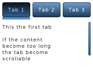
/*Create a Tab view object*/
lv_obj_t *tabview;
tabview = lv_tabview_create(lv_scr_act(), NULL);

/*Add 3 tabs (the tabs are page (lv_page) and can be scrolled*/
lv_obj_t *tab1 = lv_tabview_add_tab(tabview, "Tab 1");
lv_obj_t *tab2 = lv_tabview_add_tab(tabview, "Tab 2");
lv_obj_t *tab3 = lv_tabview_add_tab(tabview, "Tab 3");


/*Add content to the tabs*/
lv_obj_t * label = lv_label_create(tab1, NULL);
lv_label_set_text(label, "This the first tab\n\n"
                         "If the content\n"
                         "become too long\n"
                         "the tab become\n"
                         "scrollable\n\n");

label = lv_label_create(tab2, NULL);
lv_label_set_text(label, "Second tab");

label = lv_label_create(tab3, NULL);
lv_label_set_text(label, "Third tab");
Text area (lv_ta)
Written for v5.1
Overview
The Text Area is a page with a label and a cursor on it. You can insert text or characters to the current cursor position with:
lv_ta_add_char(ta, 'c')lv_ta_add_text(ta, "insert this text")
The lv_ta_set_text(ta, "New text") changes the whole text.
To delete a character from the left of the current cursor position use lv_ta_del_char(ta).
The cursor position can be modified directly like lv_ta_set_cursor_pos(ta, 10) or by stepping it:
lv_ta_cursor_right(ta)lv_ta_cursor_left(ta)lv_ta_cursor_up(ta)lv_ta_cursor_down(ta)
There are several cursor types. You can set one of them with: lv_ta_set_cursor_type(ta, LV_CURSOR_...)
- LV_CURSOR_NONE
- LV_CURSOR_LINE
- LV_CURSOR_BLOCK
- LV_CURSOR_OUTLINE
- LV_CURSOR_UNDERLINE
You can 'OR' _LV_CURSOR_HIDDEN_ to any type to hide the cursor.
The Text area can be configures to be one lined with lv_ta_set_one_line(ta, true).
The text area supports password mode. It can be enabled with lv_ta_set_pwd_mode(ta, true).
Style usage
Use lv_ta_set_style(page, LV_TA_STYLE_..., &style) to set a new style for an element of the text area:
- LV_TA_STYLE_BG background's style which uses all style.body properties. The label also uses this style.label from this style. (default: lv_style_pretty)
- LV_TA_STYLE_SB scrollbar's style which uses all style.body properties (default: lv_style_transp)
LV_TA_STYLE_CURSOR cursor style. If NULL then the library sets us a style automatically according to the label color and font
- LV_CURSOR_LINE: a style.line.width wide line but drawn as a rectangle as style.body. Hor. and ver. padding makes an offset on the cursor
- LV_CURSOR_BLOCK: a rectangle as style.body Hor. and ver. padding makes the rectangle larger
- LV_CURSOR_OUTLINE: an empty rectangle (just a border) as style.body Hor. and ver. padding makes the rectangle larger
- LV_CURSOR_UNDERLINE: a style.line.width wide line but drawn as a rectangle as style.body. Hor. and ver. padding makes an offset on the cursor
Notes
- In password mode
lv_ta_get_text(ta)gives the real text and not the asterisk characters
Example
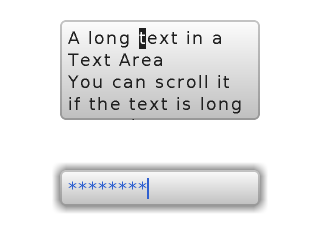
/*Create a scroll bar style*/
static lv_style_t style_sb;
lv_style_copy(&style_sb, &lv_style_plain);
style_sb.body.main_color = LV_COLOR_BLACK;
style_sb.body.grad_color = LV_COLOR_BLACK;
style_sb.body.border.color = LV_COLOR_WHITE;
style_sb.body.border.width = 1;
style_sb.body.border.opa = LV_OPA_70;
style_sb.body.radius = LV_RADIUS_CIRCLE;
style_sb.body.opa = LV_OPA_60;

/*Create a normal Text area*/
lv_obj_t * ta1 = lv_ta_create(lv_scr_act(), NULL);
lv_obj_set_size(ta1, 200, 100);
lv_obj_align(ta1, NULL, LV_ALIGN_CENTER, 0, - LV_DPI / 2);
lv_ta_set_style(ta1,LV_TA_STYLE_SB, &style_sb);                     /*Apply the scroll bar style*/
lv_ta_set_cursor_type(ta1, LV_CURSOR_BLOCK);
lv_ta_set_text(ta1, "A text in a Text Area\n"
               "You can scroll it if the text is long enough.");    /*Set an initial text*/
lv_ta_set_cursor_pos(ta1, 2);                                       /*Set the cursor position*/
lv_ta_add_text(ta1, "long ");                                       /*Insert a word at the current cursor position*/

static lv_style_t style_bg;
lv_style_copy(&style_bg, &lv_style_pretty);
style_bg.body.shadow.width = 8;
style_bg.text.color = LV_COLOR_MAKE(0x30, 0x60, 0xd0);              /*Blue label*/

/*Create a one lined test are with password mode*/
lv_obj_t * ta2 = lv_ta_create(lv_scr_act(), ta1);
lv_obj_align(ta2, ta1, LV_ALIGN_OUT_BOTTOM_MID, 0, 50);
lv_ta_set_style(ta2,LV_TA_STYLE_BG, &style_bg);                     /*Apply the background style*/
lv_ta_set_one_line(ta2, true);
lv_ta_set_cursor_type(ta2, LV_CURSOR_LINE);
lv_ta_set_pwd_mode(ta2, true);
lv_ta_set_text(ta2, "Password");
Window (lv_window)
Written for v5.1
Overview
The windows are one of the most complex container-like objects. They are built from two main parts: a header Container on the top and a Page for the content below the header.
On the header there is title which can be modified by: lv_win_set_title(win, "New title"). The title always inherits the style of the header.
You can add control buttons to the right side of the header with: lv_win_add_btn(win, "U:/close", my_close_action). The second parameter is an image file path, the third parameter is a function to call when the button is released. You can use symbols as images as well like: lv_win_add_btn(win, SYMBOL_CLOSE, my_close_action).
You can modify the size of the control buttons with the lv_win_set_btn_size(win, new_size) function.
The scrollbar behavior can be set by lv_win_set_sb_mode(win, LV_SB_MODE_...).
To set a layout for the content use lv_win_set_layout(win, LV_LAYOUT_...).
Style usage
Use lv_win_set_style(win, LV_WIN_STYLE_..., &style) to set a new style for an element of the window:
- LV_WIN_STYE_BG main background which uses all style.body properties (header and content page are placed on it) (default: lv_style_plain)
- LV_WIN_STYLE_CONTENT_BG content page's background which uses all style.body properties (default: lv_style_transp)
- LV_WIN_STYLE_CONTENT_SCRL content page's scrollable part which uses all style.body properties (default: lv_style_transp)
- LV_WIN_STYLE_SB scroll bar's style which uses all style.body properties. hor/ver* padding sets the scrollbars' padding respectively and the inner padding sets the scrollbar's width. (default: lv_style_pretty_color)
- LV_WIN_STYLE_HEADER header's style which uses all style.body properties (default: lv_style_plain_color)
- LV_WIN_STYLE_BTN_REL released button's style (on header) which uses all style.body properties (default: lv_style_btn_rel)
- LV_WIN_STYLE_BTN_PR released button's style (on header) which uses all style.body properties (default: lv_style_btn_pr)
Notes
Example
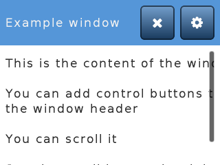
/*Create a scroll bar style*/
static lv_style_t style_sb;
lv_style_copy(&style_sb, &lv_style_plain);
style_sb.body.main_color = LV_COLOR_BLACK;
style_sb.body.grad_color = LV_COLOR_BLACK;
style_sb.body.border.color = LV_COLOR_WHITE;
style_sb.body.border.width = 1;
style_sb.body.border.opa = LV_OPA_70;
style_sb.body.radius = LV_RADIUS_CIRCLE;
style_sb.body.opa = LV_OPA_60;

/*Create a window*/
lv_obj_t * win = lv_win_create(lv_scr_act(), NULL);
lv_win_set_title(win, "Example window");                        /*Set the title*/
lv_win_set_style(win, LV_WIN_STYLE_SB, &style_sb);              /*Set the scroll bar style*/


/*Add control button to the header*/
lv_win_add_btn(win, SYMBOL_SETTINGS, my_setup_action);            /*Add a setup button*/
lv_win_add_btn(win, SYMBOL_CLOSE, lv_win_close_action);           /*Add close button and use built-in close action*/


/*Add some dummy content*/
lv_obj_t * txt = lv_label_create(win, NULL);
lv_label_set_text(txt, "This is the content of the window\n\n"
                       "You can add control buttons to\nthe window header\n\n"
                       "You can scroll it\n\n"
                       "See the scroll bar on the right!");